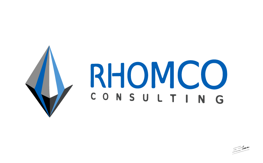
Technology logo design: a design for a construction consulting that reminds of colorful 3D pyramids
Key ideas of a construction consulting technology logo design
Rhomco consulting is a technology company, specialized in construction consulting.
The logo design is based on a technology looking structure depicting a three-dimensional rhombus.
Consulting company logo design requirements
- The company name, Rhomco, is based on the word “rhombus”. So a rhombus symbol may be used in the logo design.
- As it is a technology consulting company specialized in the construction sector, the logo itself should have a modern technology feeling.
- The whole logo design should be easy to read and identify.
- Any colour scheme may be used. There is no colour limit for this logo design, but an easy to print combination is preferred.
Why this technology construction consulting logo design works
The key was to design a logo based on a rhombus shape. Such design should take into account the main aspects of this technology consulting company: it should be a modern and innovative symbol. As this consulting business is closely related to construction, any reference to the construction sector would be appropriate too, like a three-dimensional structure or building-related icon. That’s why a modern 3D pyramid logo symbol meets the company requirements.
The three-dimensional rhombus logo was created as the combination of two opposing 3D pyramids. This design reminds of some kind of construction or structure, relating the logo design to the construction sector. Apart from the three-dimensional effect, the main logo shape and contour looks in fact like a rhombus, depicting that way the traditional consulting company symbol. So the resulting 3D pyramids, logos and designs remind of a colorful rhombus symbol.
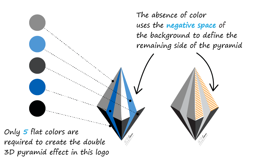
An interesting detail of this logo is the smart use of the so called white space or negative space. One of the top faces of the rhombus symbol has no color at all: it’s just an optic illusion that makes your brain complete the pyramidal logo shape. This adds a very interesting detail to the design, and allows saving one color when sending the logo to print, if spot colors are used during the printing process.
The two blue stripes inside the rhombus logo add a modern technology feeling, while remarking a rhombus like shape. That makes the logo design be more distinctive, technology oriented, and appropriate for a modern construction consulting company, adding some distinctive, bright touch to the design.
The colour scheme used in this logo design is based on blue and gray tones, which convey both a modern technology and professional consulting image. It’s in fact a professional color scheme for technology logos and for construction businesses.
The font used in this logo design is clearly readable, with a subtle technology feeling, and a professional look. A subtle perspective effect was added to the text, in order to
represent the dynamyc, forward thinking nature of this technology consulting company.
The final logo desing mixes a technology feeling with an interesting three-dimensional structure: an appropriate combination for a technology consulting company specialized in the construction sector.
Other consulting logo designs
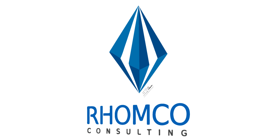
Two color technology logo design
This is a simpler version of this construction consulting company. It just requires two different colours to be printed (which, in fact, can be achieved just by using one flat ink with a percent variation). It’s always useful to have a logo version which is affordable and easy to print even when using specific Pantone colors, while keeping the 3D, technology and consulting company ideas coherent.
This version is another good example of negative space in logo design, by including the highlighted lines that split the pyramid symbol in an empty color, like the negative space in the background.
A blue color scheme has been chosen for this simpler version of the logo design: it’s a distinctive corporate color appropriate for technology consulting businesses.
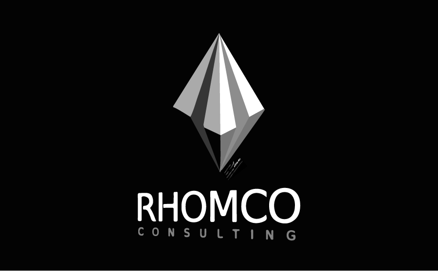
Grayscale technology logo version
Certain media or situations in which colour is not an option may require a grayscale version of the logo. This variant is specifically designed for grayscale printing purposes: it requires 5 different tones of gray over a black background.
This logo design version is specially optimized to look good even on grayscale: it has a modern technology feeling, keeping a three-dimensional effect and having even a subtle metallic shading effect. It’s an elegant version on its own that smartly solves the no colour restriction, keeping the 3D perspective.
