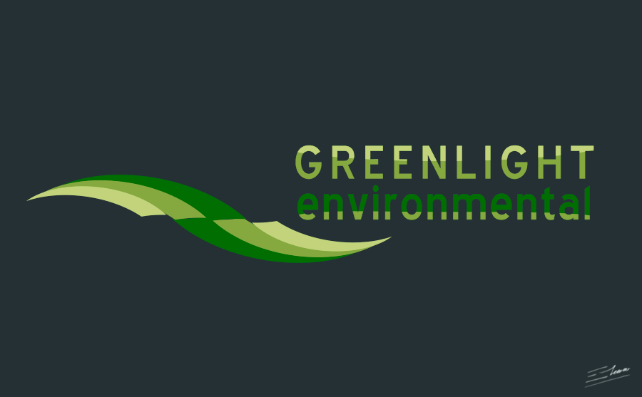
Technology logo design: an environmental consulting logotype designs. By Enrique Serrano
Main logo ideas for an environmental consulting company
Greenligth Environmental is an environmental consulting company.
This environmental consulting logo depicts an abstract symbol of technology, efficiency, speed and progress: it’s in fact a logo design for green technology.
Technology logo design requirement specification of this environmental consulting company
- This environmental company needed a clean, modern and professional logo design.
- The logo could include an original symbol with a certain level of abstraction. Industrial symbols, like drilling rigs, or derricks, should be avoided in the design.
- The logo colour scheme is limited to three spot colors with no gradients. Obviously, a green colour would be appropriate.
- The idea is to convey a sense of technology, efficiency, speed and progress through this environmental consulting logo design.
- Any font may be used, but try to avoid some overused fonts such as Times New Roman, Helvetica and Arial.
Why the environmental consulting technology logo design works
Some of this environmental logo ideas are as follows: the key was to design a fully original symbol that met every one of the key environmental consulting company requirements. Taking as a starting point the idea of green, light and the environmental consulting concept, I created a green leaf-like symbol and started tweaking it to depict into the logo these main environmental consulting requirements.
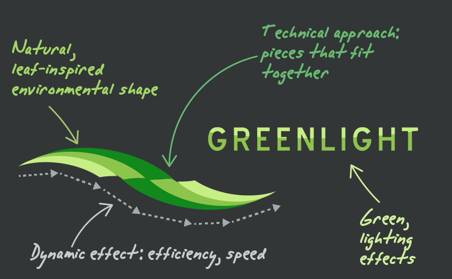
By creating a swoosh leaf-like effect in the logo, such symbol conveys an idea of environmental services and of efficiency and speed. The whole logo design looks like an advancing structure, that gives an idea of progress. By cutting the symbol as pieces that fit together with a subtle three-dimensional effect, the logo gets a modern technology look. It helps to reinforce the moving and progress idea by leading the viewer’s attention across this logo design.
A clean and easily readable font was used: it adds subtle interesting details to the logo design, that distinguish the font from overused plain fonts, without making the company name hard to read. The green light part of the name was written all in uppercase in the logo design, to give more importance to the most distinctive part of the logotype text.
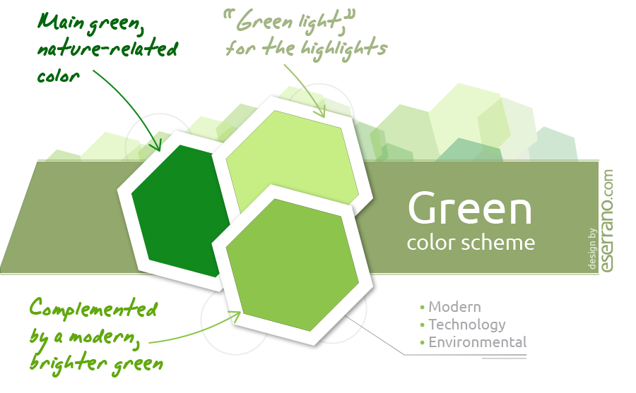
This logo is based on a modern green color scheme: it uses 3 different green tones, and is specially suited to work on dark backgrounds. Green was the best choice for this logo design, due to the environmental consulting nature of the company, and the very firm name, green light. By combining these green tones the logo symbol gets a subtle 3-D feel, and the logotype text gets interesting lighting and shading effects.
The final logo design features a very original symbol that depicts every one of the key company aspects: technology, speed, efficiency, and green (environmental) consulting services.
Other green technology and environmental consulting logo ideas
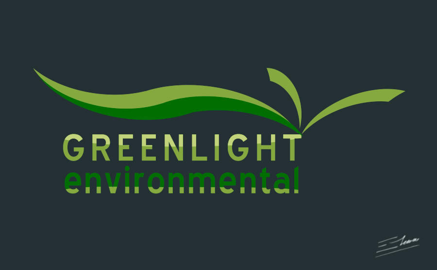
The Green Leaf environmental logo
This is an alternative logo design that shows a different symbol: three green leaves, integrated with the design of the logotype text. Again, it focuses on the green environmental consulting idea, with an ecological efficiency feeling.
I finally discarded this logo design as the green leaves symbol relies on its combination with the typographic design, so it wouldn’t work as well when used as a standalone logo symbol. Besides it had a strong eco-feeling, focusing on leaves and growth, it didn’t depict the efficient, speed idea as well as the other version, and had no elements strongly connecting it to the concept of technology. So the original more compact and iconic logo was chosen at the end of the design process.
