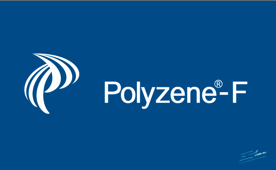
Medical logo design: Polyzene-F medical equipment chemical coating image designs by Enrique Serrano
Key Polyzene-F medical coating logo design ideas
Polyzene-F is a chemical product used in medical industry as medical equipment coating.
This logo design reminds of a “P” symbol made of two modern and dynamic coating layers.
Customer’s medical company logo requirements
- The key is to create a high tech medical logo design for chemical products used as medical equipment coating.
- The Polyzene-F logo should be modern, innovative and distinctive.
- As the product is a chemical coating polymer, its logo may be used together with other product logos. Therefore, the logo design should complement other logos nicely, while remaining distinctive.
- There is a maximum color limit of 4 colors. The color scheme chosen should be based on a medical logo design, as it is the main application of this chemical product. On the other hand, this polymer coating may be used in other industries (not only medical, but also industrial or household). So te colours of the logo should be easy to change, to fit each industry application.
- A medical device coated with Polyzene-F has special properties that this medical logo design should take into account. Medical equipment coated with this chemical product is gentle, compatible and less damaging compared with other non-coated medical devices.
- Apart from its medical equipment coating usages, the polymer boasts other interesting properties, such as high range of elasticity, resistance to water, is non-swelling and has low gliding resistance. The chemical polymer logo design should remind of these qualities.
Why this medical equipment coating logo design works
The main idea is that the logo image reminds of a “P” symbol, based on the chemical polymer name: Polyzene-F.
As the main usage of this chemical product is as medical equipment coating, the logo design should depict in some way these coating properties. That’s why the logo image was designed like two modern looking layers: the top of the “P” logo symbol flows covering the lower symbol layer.

The main applications of this logo focus on the medical industry. This chemical product promotes faster healing, protects against bacterial infection, and prevents inflammation. So the look and feel of the logotype design should match those healing and well-being properties. That’s why I developed a medical logo design based on modern, smooth lines and soft appealing colors. Any medical related logo should convey non-aggressive, innovative and constructive feelings. I think that the final logo reflects perfectly a gentle and non-damaging image.
Apart from its medical usages, Polyzene-F is in fact a chemical polymer. The chemical structure of Polyzene-F is like a long and twisted molecular string. I wanted to take this also into account when creating the logo image. So I created the “P” coating layers as structures made of smooth flowing molecular strings.
The perspective effect used in the logo adds an interesting motion and dynamic feeling. This depicts the other non medical related properties of this chemical polymer: elastic, with low gliding resistance.
The blue color scheme chosen for this logo is gentle and modern at the same time. That way the logo design will convey relaxing feelings, as well as high tech feelings. I find this color combination very appropriate for high tech medical applications. But the resulting image looks modern enough to fit other chemical applications, such as those typical of industrial or household environments.
The chosen font should match this high tech medical logo design. So I chose a light, modern, easily readable font. It would be easy to identify, gentle, and innovative as well: the perfect combination for any medical or industrial polymer usage.
The resulting logo design is a modern and distinctive image, which could be easily paired with other medical product logos (due to its original, clean and compact design). And it could fit any medical equipment coating application as well as other industrial coating usages.
Other polymer logo design variants

2-color medical logo version
The main logo design makes good usage of just 4 different colours (which could be eventually reduced to 3 colors with an opacity variation). But I have faced many times that, in real life, you often need a simpler, easily recognizable and easily printable logo version.
This version is composed of just two flat colors (or just a blue color tone over a white paper). So this logo design is extremely easy to recognize and very cheap to print, while keeping a distinctive and appealing medical image.

The coated sphere concept
The first approach of this logo design was a very iconic concept, mostly focused on the idea of using this new polymer as a medical coating system. Also, as polymers are based on the repetition on modular units, this was the structure chosen for the coating design.
Even when this design addressed the “coating polymer” parts, and could have been combined pretty nicely with other product logos, it is true that it wasn’t as dynamic as the final P-shaped design, so it was finally discarded in favor of that more distinctive approach, which would work pretty well in a medical environment, and that would stand out even on its own.

Different logo versions for different target markets
The main target market for this new polymer would be focused on medical usages. However, the goal of the company is to expand the usages of this chemical coating to the industrial and household markets. Hence, different logo variants could easily identify the product according to its specific application, just by changing the color scheme of the final design.
By using different vividly colored backgrounds, the same symbol can be kept, while quickly telling apart the target market where this brand is beign applied.


