Logo design for a creative marketing and tech consulting company: Iridium Interactive
Main Iridium Interactive consulting logo design ideas
Iridium Interactive is an international tech consulting and interactive marketing firm. The company tag-line is “Your thought Partner”.
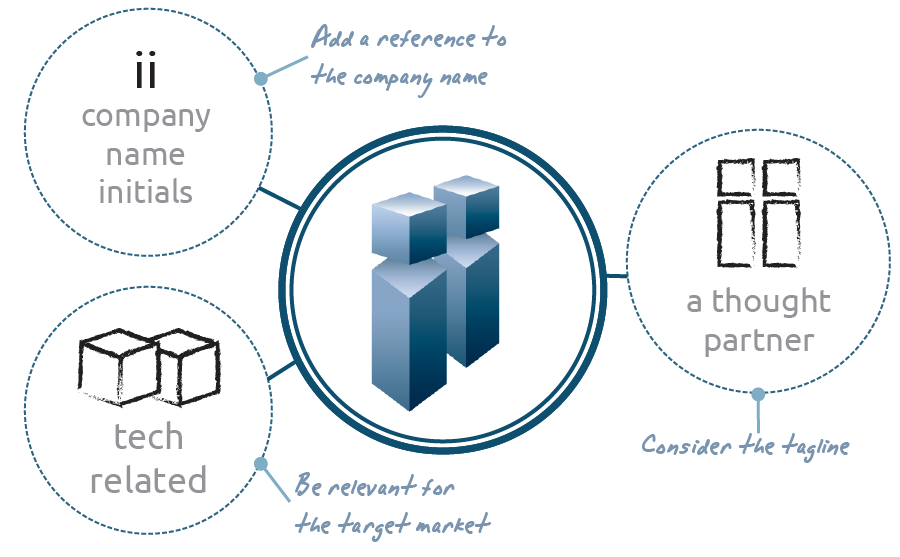
The logo design symbolizes this marketing company name initials, “ii”, as well as two people thinking together, in a modern and creative way.
Iridium Interactive logo design requirements
- The tag-line “Your thought Partners” and any representation of the company name have to be included into the logo.
- The logo design should be of a professional, modern and creative style.
- This logo should depict an interactive high-end agency, an internet consulting company and a thought partner.
- Any colour scheme may be used. The logo design may include gradients as well.
Why this creative marketing and tech consulting logo design works
This Iridium Interactive logo design solves every main customer requirement: it depicts the company name initials, “ii”, in a modern and creative way, and symbolizes at the same time a thought partner.

This double “i” logo symbol reminds of two people thinking together, but it is also a strong tech looking corporate identity. A blue color scheme complements the tech geometrical “ii” logo design, conveying an idea of modern technology consulting company. It’s in fact a professional and high tech feeling color combination.
The two fonts combined in the logo accomplish specific tasks: the nearly futuristic “Iridium Interactive” font gives an idea of high tech internet consulting company. While the tag-line font looks more inviting, softer and creative: as an interactive marketing thought partner should be.

So, this Iridium Interactive logo design seamlessly combines the company name, a modern tech internet consulting feeling and an inviting thought partner concept, that become very appropriate for a modern creative marketing company.
Other consulting logo design variants for II

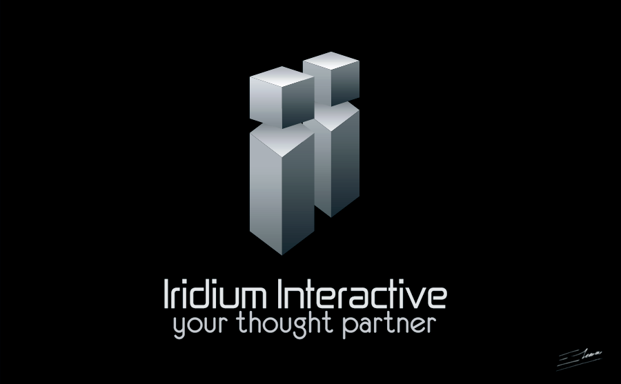
Silver corporate logo design variant: the black plastified business card idea
This is an alternative design of the Iridium Interactive logo. This time I have used a sober an elegant silver color scheme, which fits perfectly on dark backgrounds.
The other logo concept had a little more inviting and creative feeling. But I’m very fond of the professional and corporate looking of this version. Creating a black, glossy, plastified business card with this logo design really distinguishes you from your competitors with a high-end connotation, which is appropriate if you target big technology companies for your consulting services.


