POS Services logo design: Point Of Sale services corporate image designs by Enrique Serrano
Key Point of Sale services logo design concepts
My POS Services is a company that provides restaurant and hospitality industry services that complement individual point of sale services and other third party solutions.
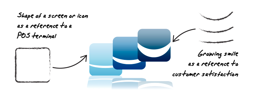
As the company main goal is to obtain customer satisfaction through advanced POS services, the logo design focuses on this concept combining a point of sale screen with a growing smile image.
POS services company logo requirements
- The POS services logo should be an appealing, functional and modern design.
- Any image that depicts modern POS services may be used in the logo design.
- The logo may contain gradients. As there is no corporate color scheme already defined, any color scheme may be used.
- The main company objective is to install advanced point of sale services, such as loyalty programs and gifts based on collected customer data, to increase the satisfaction of the end user. The logo design should take this customer satisfaction goal into account.
Why this advanced point of sale services logo works
This point of sale services logo design is based on the main company objective: a modern POS screen that provides increasing customer satisfaction.
This “customer satisfaction” idea is depicted as a “growing smile” symbol, enclosed in what reminds of a point of sale screen or touch-sensitive icons. The three POS screens were arranged in an ascending layout which, combined with the depth effect, makes the logo image look like an increasing smile sequence.

The reflection of the image adds a subtle web 2.0 tech company feeling. It will immediately identify the company as a modern and fresh-thinking business. It’s an eye-catching design effect that will look great when displaying the logo design on a webpage.
The blue color scheme chosen is both modern and trustworthy. These colors remark the advanced services provided by this company in a professional way. So this color scheme, combined with the soft lines of the logo image, conveys a modern, professional and appealing corporate image.
The font used in the logo is easy to read and modern as well, so it perfectly matches the image style. The subtle detail of using a different color for the “my” word remarks that part of the company name. According to the company philosohpy, once such advanced point of sale services have been installed, no additional fees or support services are necessary. So it’s important to remark this “my” word, as a personal, ownership symbol, that really distinguishes this POS company from other point of sale businesses.
The final logo design is an appealing image that depicts increasing customer satisfaction through advanced point of sale services: a modern company with innovative solutions that will help you improve your relationship with your customers.
Point of Sale logo design variants

Simpler POS logo design
Besides the customer was not worried about print costs and the usage of gradients, it’s always advisable to have a simpler, easy to print logo version. So I created a compact, 3 flat color logo design that looks nearly like the original logo. I removed the logo reflection as well, in order to make this logo image easily recognizable even when printed at a small size. The result is a bold, all terrain logo design, easy to use in any situation.

The handshake sale logo design
Customer satisfaction was the key requirement of this logo design, as that is the main goal of a successful transaction carried out through these Point Of Sale terminals. That’s why original designs of this logo were mostly focused around this concept. And actually the handshake symbol seemed to be a good idea for this purpose.
An initial version of this logo was created, based on a unique, warm depiction of a handshake, as the closing of a sale, and a symbol of agreement and satisfaction. Even a different typography design was used in this case, with a compact blend of a friendly, rounded font with a clean, modern, and more technological-related typography.
However, in some ways this design was less related to the terminal itself, so it was finally discarded in favor of the previous design, as it was unique, more specific and more connected with the underlying technology of the point of sale systems.


