Professional logo and printing company identity design: a GP symbol designed for Digital Printing
Key concepts of a professional digital printing logo and company identity design
Gangway Printing (GP) is a modern digital color printing company.
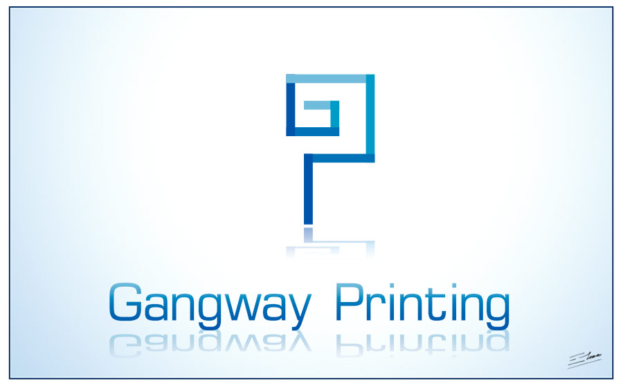
These professional Gangway Printing logo and company identity designs introduce this printing company as a very modern digital printing business by combining the company name initials, GP, in a modern colorful, gangway related, and digital looking logo design.
Requirements of the printing company logo and brand identity
- Gangway Printing wanted a professional logo and identity design, appropriate for a modern digital printing company.
- The name Gangway Printing should be included in the logo, and maybe also the tag-line “bridging the gap between you and your customers”.
- The logo design can include any number of colors, including color gradients, but it should work in CMYK.
- The logo symbol may use the printing company name initials, “GP“, or a gangway related symbol.
- The key is to create a modern, vibrant, strong and forward thinking logo and company identity design.
An effective logo and printing company identity design
The key concept was to design a modern and professional company identity based on this printing company initials, GP. So I created an original custom GP logo symbol, that had a digital feeling due to the modern straight lines, that reminded of interconnected gangways and that really stood out because of the color highlights.
A modern digital blue based color scheme was chosen for this digital printing logo design. A dark background helps to make the logo symbol stand out, while it conveys a professional company identity. The subtle radial gradient effect leads the attention to this main GP logo. The reflection conveys a modern design and sleek printing service feeling. And the color shading effects create some 3D look and make this logo design more colorful, appropriate for a color digital printing company.
The logo typography is a modern sans-serif font, without complex decorations: the company name, Gangway Printing, should be easily readable, and should be clean enough to depict a professional printing company identity. This font is consistent with the rest of the logo, as it also features some straight lines and a square block structure. The subtle color gradients and the reflection add some eye-catching and modern effects, coherent with the rest of this logo design.

The resulting modern logo creates an effective color digital printing company brand identity, because it features the company initials (GP) in an original way, it reminds of the printing company name due to its connected gangway looking structure, it’s digital printing related due to the straight lines and the digital blue color scheme, it’s modern and colorful because of the reflections, highlights and gradient effects, and it’s also elegant and professional enough due to the clean and elegant concept and design.
Other logo designs for this professional digital printing company identity

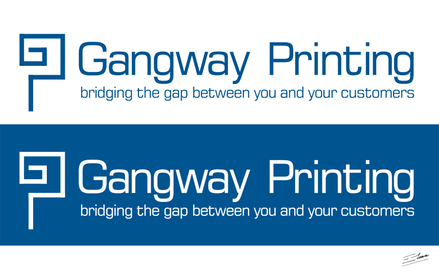
One color GP digital printing logo
The main GP printing logo design is a very colorful and eye-catching design. Nevertheless, it can become somehow difficult and expensive to print, as multi-color logos may prove complex to print under certain surfaces and especially at tiny sizes. So I designed a variant of this main GP logo, more compact much easier to print: it requires just 1 flat color ink, and it’s easily recognizable even at a small size.
As a result, this simplified GP digital printing logo design keeps the main ideas of this professional company identity design, while being extremely useful in most printing situations.


