Signature Realty logo design by Enrique Serrano – a signature that reminds of realty
Key realty logo design ideas
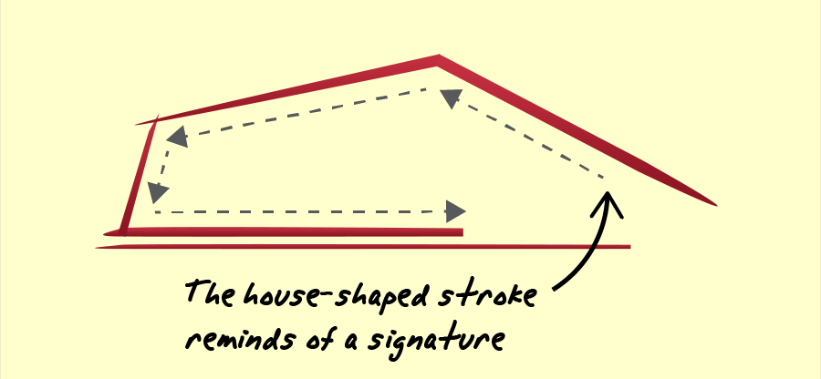
The logo focuses on the real estate company name, “Signature Realty”, presenting a house and the text in a way that reminds of a signature.
Customer’s realty logo requirements
- The logo style should be clean, simple and professional.
- The idea is to combine the signature concept in the logo in a somehow abstract way.
- A script font is OK, but the logo should be easily readable. The logo should also include the tagline “Think Results”.
- The logo may be printed in big signs, so it should be easily visible and recognizable.
- The logo could contain any number of colors. Color gradients are allowed in the logo as well.
Why this realty logo design works
This logo depicts the company name and main concept in a very clean and clear way. The company name is drawn like a signature, which also reminds of the shape of a house in a conceptual, almost abstract way. So both key company concepts are taken into account in this logo: the signature-looking text, and the house (realty-related) shape, making the whole logo meaningful and easy to remember.

The selected script looking font is bold, easily readable, while helping to reinforce the signature style of the symbol, as it retains some handwritten font character. However, the design of this text keeps a professional image, as it is still a quite easy-to-read font design. Its look and its meaning make the whole logo memorable and easy to identify.

On one hand, this logo design strives to stand out, and on the other hand, the image it needs to convey has to be professional and reliable. The color schemes chosen were selected to be both, professional looking and eye-catching at the same time. The red and light beige color scheme chosen is highly visible and easily recognizable, with a good balance between being bright and professional. Red conveys a concept of strength, while the calm beige background gives a more professional, traditional and experienced connotation to the image of this real estate company.
This realty logo is great for printing on big advertisements and wooden signs because of its highly visible color scheme and its easily readable font.
Summarizing, this highly visible and easily readable clean logo will identify the company and make it easily recognizable (as a realty company) even from the very first glance, by combining a simple logo with signature and real estate related concepts.
Other realty logo design variants

Dark background – warm realty logo
This logo variation uses a dark background and a warm color scheme. The orange “signature realty” color gives a fresh and eye-catching feeling to the logo, making the logo text extremely visible.
The whole sign may become a little less visible due to the dark background, but the key point in this approach is that the realty logo text will be extremely visible because of its high contrast. This would also be a good color combination if you intend to stamp your sign on a light-colored wall. Finally, this warm color scheme is probably more classic and traditional, so it would work very well making the real estate firm look trustworthy and professional.

Relaxing green realty logo version
This logo version uses a relaxing green color scheme. The bright realty logo text keeps it highly visible. And the dark green background helps to make the text stand out again, while creating a solid and professional base.
As this whole realty logo conveys relaxing feelings with a more nature-related , I find this variant specially well suited to use on wooden signs on land available for building, or even on gardened small houses for sale.


