Raymond Fry logo design by Enrique Serrano
Key logo design ideas
Raymond Fry is a voice acting company that provides voice-over services for documentary films, movie trailers, video game voice acting, etc.
This RF logo symbol focuses on the voice acting founder’s name, Raymond Fry, making it instantly recognizable.
Customer’s company logo requirements
- The logo should convey a sense of partnership and commitment.
- Any symbol could be used but any voice acting industry cliché symbol should be avoided as well.
- As there will be little personal contact with customers, the importance of recognizing and remembering the logo is critical.
- The corporate image should be strong, immediately recognizable.
- An earthy colour scheme should be used – like a warm Autumn colour scheme.
Why this logo design works
This logotype design satisfies the main customer’s objective in an effective way: as the importance of remembering the company name is critical, the best logo choice has to focus on the actor’s name, in a simple and memorable way.
The RF logo symbol is very simple, but original and easy to remember as well. The appealing clean curves of this RF logo are both trustworthy and inviting at the same time. So the corporate image remains professional but still approachable, remarking this attitude of “commitment” that distinguishes Raymond Fry’s business from its competitors. This bold corporate image also reinforces the “passionate distinctive” of Ramond Fry’s company. The easily readable, but still distinctive and interesting fonts, complement the logotype design.
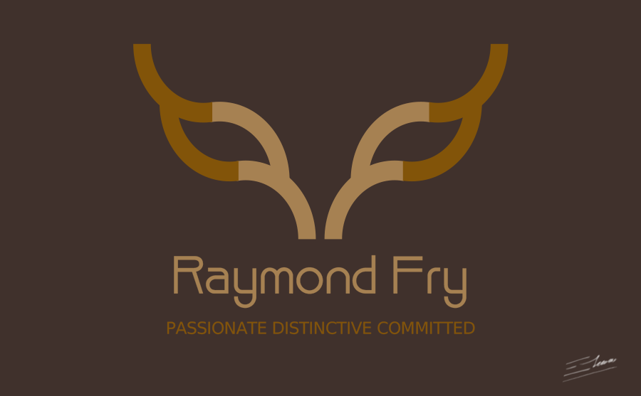
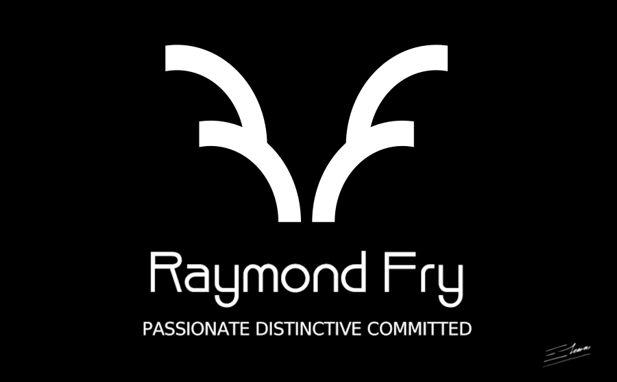
This logo requires only two flat colors over an earthy brown background. The warm color scheme helps to convey professional and trustworthy feelings, remarking the strong ideas of passion and commitment. A very easy to print black and white version was also provided.
A memorable logo should focus on the company name, and should always be distinctive, but clean and easily readable at the same time. It stays away of topic voice acting overused logos. In fact, the logo remarks the actor’s name, and depicts his personality and passionate distinctive commitment. It is expressive. It is straightforward. It is unique.
Other logo design variants

RF passionate distinctive logo
This logo version extends the RF symbol with smooth flowing curves. The resulting image reminds of two interesting bold and expressive eyes, or of a mask.
Such concept would have been quite appropriate for a passionate voice acting approach: facial expressions are hidden, but the emotive acting message is conveyed by the voice.
Summarising, this logo version is a more complex concept – but, on the other hand, it’s a quite interesting and appealing design that focuses on the passionate distinctive idea.

Black and white RF logo version
This black and white version demonstrates that the final logo is easily printable enough to be still identifiable when used on some color-limited media such as fax paper or similar.
So this logo design will work in real life. It will be easily printable in a wide arrange of different media without becoming hardly recognizable or extremely expensive – and that may become a priority when establishing a strong corporate image.


