OMC computer logo design: designs of corporate image and logos for communication and networking by Enrique Serrano
Key OMC computers logo design ideas
OMC computers is a networking and communication business. They sell computers, set up networks and provide communication and hosting solutions.
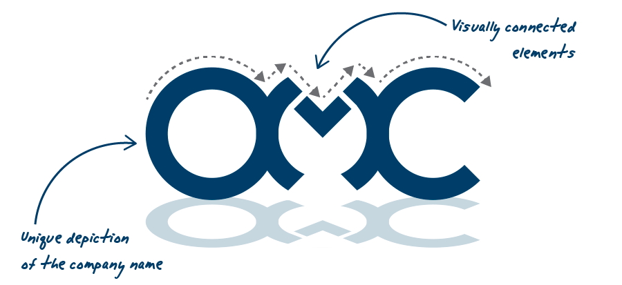
This logo design focuses on such computer business name, in order to make the company very memorable, with an emphasis on connected elements and a high-tech feeling.
Computer business logo requirements
- The logo has to be professional and sophisticated: corporate, smart, modern but not too fancy.
- This logo design may only include up to three flat colors.
- These main corporate business ideas should be taken into account when designing the logo: computers, communication, networking, “everything is connected”.
Why this computer logo design works
This unique and fully original OMC logo design is based on interconnected letters depicting the company name. It conveys the idea of networking and communication, as everything is connected. The corporate design has also a modern, high tech looking which perfectly fits a computer business image.

Another important fact about this computers logo is that it focuses on the business name in a clearly readable way, but distinctive enough to work as an standalone symbol. So this logo design makes easy to remember this company name. It’s a very compact and recognizable design that would look great printed as a seal on a personal computer.
Logos of computers and communications should mix a modern touch with a professional feeling. That’s why a blue color scheme was chosen for this logo design: it looks modern but also professional and computer business oriented. This logo can be printed with very low print costs: it requires just one flat color
(using an opacity variation for the shade effect).
The main font used for the “OMC” is a fully custom typography, so this unique logo design will immediately identify this computer business with a clean and straightforward approach. The main idea behind this font is that everything is connected, strengthening the communication and networking ideas of this computer business. Another tech looking font was chosen for the logo tag-line to keep a high-tech computers logo feel.
The final corporate logo is a modern, memorable and unique design: it’s practical, easily printable, fully original, very distinctive and strongly computer and communication related.
Other OMC computer logo versions

The “Communication” logo design
This logo variant focuses again on the three main business aspects: the company name (OMC), the communication and networking concept (depicted as interconnected letters) and the computer repairing services (seen as pieces that fit together). It takes the communication part one step beyond, completely connecting the top part of the three main letters together. Each character in the design remains recognizable thanks to the effect of the reflection at the bottom.
This design requires just one flat color. The lighter blue effect can be achieved just by decreasing the ink opacity when printing over a white background. So the logo design remains easy and affordable to print, even using spot color inks for maximum color precision.

The bolder logo design
Another logo design approach based on the same technology, computer, communication, and networking ideas: an original interconnected OMC logo symbol. The subtle shadow effect conveys a tech 3D sphere effect, while keeping the logo design simple.
This logo version as a whole looks like a bolder and heavier design approach of the “pieces that fit together” and “interconnected systems” concepts.


