Logo design inspired by space concepts for an aerospace technology company, AI Tech
Key AI Tech engineering logo design concepts
AI Tech is an aerospace technology company that provides space engineering and defense services. Their main concept is how their work is connected with the space and technology.
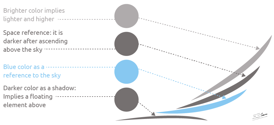
The logo design is based on a tech symbol with a motion effect, heading in a new direction: in fact, it depicts a flying structure, connected with the concept of space.
Aerospace company logo requirements
- The AI Tech logo design should have a crisp and professional look.
- Any color scheme may be used, but a simple and clean color set is preferred.
- A modern-style font could be included in the logo design.
- The logo should depict the main company ideas: space, technology, engineering, headed towards the space in a dynamic way.
Why this aerospace technology logo design works
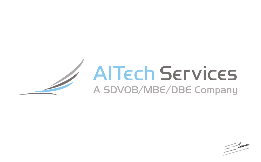
This logo design takes into account all of the main customer requirements. The logo is based on a modern tech looking rising symbol: it looks like something light, appealing, dynamic, on the move, headed in a new direction. In fact, as the logo symbol is rising, it also depicts something related to this company name, which inspired the whole image: the flight and space part of the AI Tech work.
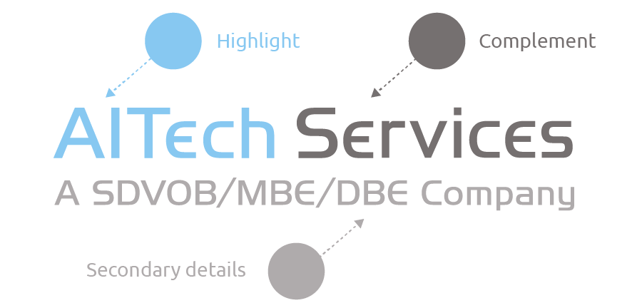
The color scheme chosen for this logo design is very appropriate for an aerospace technology company: the bright sky blue, combined with a cool gray scheme, conveys a modern tech feeling, with a nod to the sky, while staying clean and professional. This color layout also helps to add a motion and dynamic effect to the logo, leading the eye in an ascending way. And all of this is achieved just by using three different flat colors.

The modern, sans-serif font used in this logo design mixes soft lines with a modern space tech or engineering feeling, staying professional while conveying inviting and aerospace-related feelings at the same time. Colors are used to clearly tell apart every element of the company name, making sure to highlight the most distinctive brand.

The idea is that this logo is not only a modern and appealing crisp image, but also an space-related design, which perfectly fits this aerospace technology company. A simple logo, but also a strong, modern and memorable design.
Other AI Tech engineering logo versions

The “Rising Wings” logo variant
Before I developed the main, final “AI Tech” logo symbol, I explored several logotype variants. Besides these other logo versions were not so simple, crisp and clean as the final logo, some of them are still aesthetically pleasing and meaningful.
This design reminds of some “rising wings” shape. It’s also a AI Tech inspired symbol: it’s a little bit more complex than the final logo, but it clearly illustrates the modern “Space Tech” concept, headed towards space, as a rocket taking off.

The “Blast-off” logo version
This logo version is inspired by a space-headed concept in a very direct way. While the final logo rises in a subtle and smooth way, this other logo version reminds of a “blast-off”, an arrow that is pointing straight to the space, rising like a rocket, with supporting design elements that add motion, or that even remind of the smoke cloud of the igniting rockets of a spaceship – while being a clean symbol that even reminds of a light feather.
The color scheme used in this logo version is exactly the same as the final logo color scheme. As this image demonstrates, all of these logos work perfectly also on a dark background.


