
Telecom logo design: a communications engineering, web 2.0 design, by Enrique Serrano
Main Communications Engineering logo design ideas
Elcom Telecom is a communications engineering company, with a modern web 2.0 business style.
This design focuses on this telecom company name, depicting a communications concept (through the radio waves symbol) with a deep web 2.0 logo design style.
Communications engineering company requirements about the logo design
- Elcom telecom was looking for a modern logo design, with a Web 2.0 communications company style.
- The key is to focus on the company name: make your clients remember your name, and they will always remember you. The logo text should be written all in lowercase, in a inviting, web 2.0 design way.
- No color scheme is defined for this telecom company. But a custom logo made of vivid and bright web 2.0 design style colors is preferred.
- Additional logo symbols are unnecessary. The idea is to direct the attention to the name, making it a memorable, web 2.0 design by itself.
An effective web 2.0 design style for a telecom logo
The key was to create a modern and inviting logo design with a web 2.0 design style, focusing on the telecom company name and giving an idea of communications engineering services.
The starting point for this logo design was to focus on the telecom company name. A web 2.0 style font was chosen: bold, sans-serif, modern, easily readable and composed of inviting, softer round lines.
Then an element that added an idea of communications was added to this logo design. By creating two radio wave lines in the top right logo corner the design conveys an idea of telecommunications, which does not compromise the readability of the company name. The design stays as a clean and legible logo that focuses on the telecom company name, but it also has a strong communications engineering sense. So the idea of a logo design with radio waves is still appropriate for a professional telecom logo while being an even more meaningful and original telecommunication related idea.
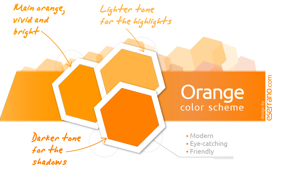
A vivid orange color scheme was chosen for this web 2.0 style logo. Web 2.0 logos usually have bright, shiny colors. It’s a modern, fresh and eye-catching design style. Apart from the reflection effect (which is also very typical of a web 2.0 style), this telecom logo uses only 3 flat colors. So it’s an easily printable logotype that will work also on traditional stationery, and not just on the webpage.
The so-called web 2.0 logo designs defined a trend that left a permanent mark in modern logo design styles. Essentially, the main features of a pure web 2.0 logo design are defined as follows:
- There’s a strong focus on the company name, as making the name memorable is a key goal. Accompanying symbols become optional, supporting elements.
- The web 2.0 fonts combine some friendly traits (soft curves,) with a modern style and bold lines (that makes them easy to color or to read against vivid backgrounds.)
- The color schemes chosen in web 2.0 designs are composed of bright, vivid colors. Since web 2.0 companies rely on Internet as a strong telecommunication foundation between all their users, these desigs will be mostly used online, on a computer screen. Color limits aren’t as important in these designs, and color gradients that make the design stand out become even more frequent.
- The backgrounds chosen for these logo designs tend to favor clean, white spaces, with the look of shiny, reflective surfaces, by adding a very subtle reflection effect to the logo design.
![]()
In a nutshell, a web 2.0 style conveys a modern, tech feeling, with a vibrant, approachable and friendly touch. It’s actually a consequence of blending together technology with the active participation of their target audience.
The final logo is a simple and clean design, that remarks the telecom company name as well as communications engineering ideas, with an intense web 2.0 design style: friendly, inviting, eye-catching, even somehow playful, but innovative and modern professional at the same time.
Other telecom engineering logo design versions
![]()
Professional telecom logo design
This is a more classic, conservative design created as a first draft of the logo for this telecom company, as the customer requirements were being identified. It’s based on a classic, professional and elegant approach rather than a pure Web 2.0 design style.
A serious obsidian color scheme conveys a very professional and technical communications engineering company image, while the reflections and shining appearance of the logo design give a modern company idea. But finally, the telecom company switched to a vivid and eye-catching web 2.0 style, with brighter colors and bolder fonts.