How I ended up appearing in the credits of an award-winning film
The name of the project was “Flowers of Rwanda.” The director of the company where I worked had traveled to Rwanda for almost a month, together with a small crew, to film a documentary about how the country recovered after the genocide that took place there, and about how the children were the new hope of the nation.
It was a very moving project of an amazing scope. Video editing and post-production work lasted for a few months. Even I helped to create some depth of field FX for the intro video. We all were deeply involved into it.
The marketing work continued once the film was ready. A website was created to introduce the documentary, display a few video clips and stills, sell DVD copies online, and allow reporters and distributors to directly contact us. I was in charge to program all this whole site, and I ended up being credited in the documentary as “Web design – Enrique Serrano”.
The Goya Awards are the most important film recognitions in Spain – so we consider them something like “the Spanish Oscar Awards.” When Flowers of Rwanda received the Best Short Documentary award, we all cheered.
Even our website itself received a few awards from pages that curated a list of featured designs, so popular in those days. It was pretty rewarding to see it featured among the few designs that Design Licks would choose every week, surrounded by the official page of The Chronicles of Spiderwick, and the official page promoting Halo 3.
It made me happy to be part of that project, as it carried such an important message, and as it achieved such high recognition.
The technical aspects of the website of this film
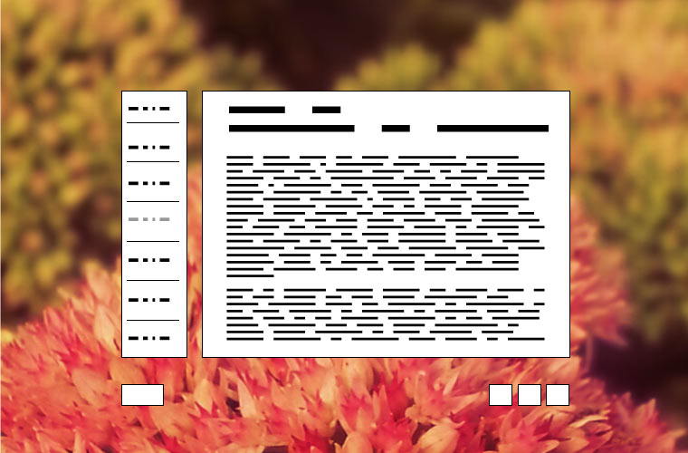
Once the movie was completed, we took advantage of a gap in between our regular projects to complete the website of this film. We decided to create a framework that could be re-used in the future, as upcoming films would also need a similar mechanism of promotion. We eventually ended up creating a framework based on card-like structures with texts, floating over a colorful background.

Even if website design trends have evolved a big deal since that moment, there were a few highlights on that project:
- We used fullscreen imagery as the background of the page, with a slight parallax effect.
- The contents would load dynamically, for maximum loading speed.
- The transition between sections was animated, with some principles that nowadays would remind of material design.
- The elements on the page would be re-positioned and re-sized according to the screen size. We were creating responsive designs before the term was even coined.
- We embedded our own videos in the page, with no third party watermarks. We used a very efficient compression, that ensured good quality, fast-loading web videos.
- It had a basic, integrated e-commerce module that enabled online purchases.
The website was ready in less than one week. It was a fast, unique, effective solution, whose basic framework we kept re-using to speed up the promotion of our other films.

