
When Building Trust and Being Contacted are your Main UX Goals
What would you look for if you were about hiring somebody to represent you in a very important matter? For personal injury lawyers, it’s essential to show their experience and professionalism, building trust. And that’s what I made sure to highlight during several user experience optimizations of Chris Dixon’s website and other related pages.
“Don’t neglect your wins” was our PR motto. After all, not all lawyers are part of the Million Dollar Club, have been featured as Top 40 Lawyers Under 40, or are in the Top 100 Trial Lawyers list. When you’ve worked with Chris, his reliability shines by itself. But for first-time contacts, all these competitive advantages were well worth highlighting through Chris’ websites.
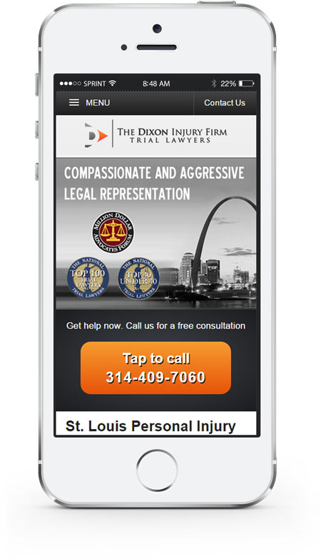
After identifying our goal and our main strengths, the appropriate UX updates were carried out. It was easy to find contact details in the resulting version. Chris’ branding was extremely distinctive. The main headlines would reassure our potential clients about arriving at the right place. And trust seals abounded over the fold. Then, detailed areas of expertise and successful case explanations would follow.
We measured how the new upgrade worked, tweaked some UI elements, saw our conversion rate improve and enjoyed an enhanced website.
Then the world changed.
User Experience, context and emergencies
Our main user base had been composed of people researching a good lawyer for their case, comfortably sat in front of their desktops, reading through all the details of similar cases, reviewing Christopher’s professional career, and finally sending an email or picking up the phone.
But this all changed once smartphones became so popular. More and more people would start browsing the website on the go, on a screen as small as the palm of your hand.
Would you read a detailed explanation while on the go? And in the case of a personal injury firm, do you expect your potential clients to read a long text, on a small screen, after being in an accident, or recovering from an injury?
That is why good user experience design should also take into account the specific context of each user. The priorities of our mobile users weren’t so focused on deep research: they just wanted to get immediate help.
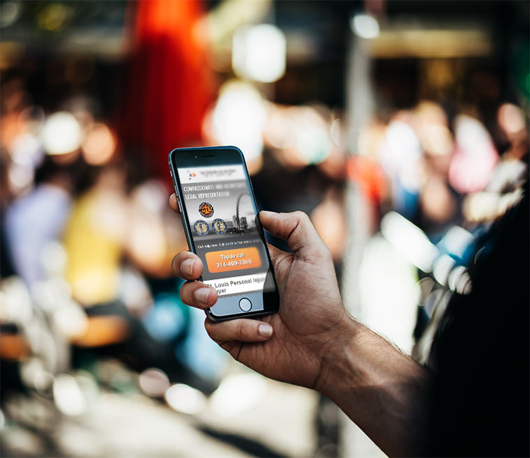
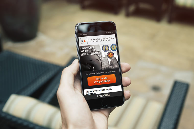
When you have a phone in your hand, and you’re in the middle of an emergency, your most natural option is to call.
Taking this main goal of our mobile users into account, I developed a completely enhanced mobile user experience, where big, easy to press “tap to call” buttons would be present in every right area.
When responsive design cares about branding and context
The new version of the website was completely re-coded as a mobile-first page. Mobile users don’t have fast connections, may have data limits in their plans, and (especially if contacting in the middle of an emergency) won’t have a second to waste.
Hiding elements in a modern responsive design isn’t a recommended practice because you’d be making your users download information that they might not be using. However, good responsive design should also take into account user context. Our mobile users could be in a hurry, in the middle of an emergency, with a phone already in their hands, so displaying tap to call buttons only in this versions made perfect sense. However, non-essential content wasn’t even loaded on underpowered mobile devices, to guarantee a smooth browsing experience for all kinds of potential users.
Chris’ law firm had become a well-known brand in the sector, and your branding is well worth preserving, especially if your users already recognize and remember who you are. The image and “look and feel” of the desktop version was exactly preserved, while every component was carefully placed and rearranged in the responsive versions of the sites.

Finally, reprogramming the sites to use compatible technologies allowed all users to watch HTML5-based video – including tablet users where Flash wasn’t an option anymore. By providing WebM and MP4 videos, and embedding javascript-based carousels, compatibility was assured in any possible device.
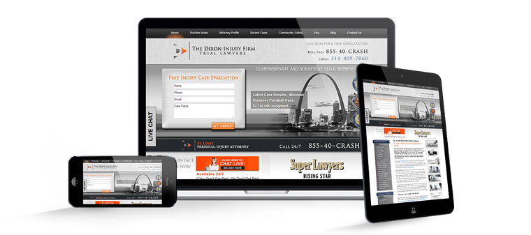
The result is a set of responsive websites that highlighted the legal experience of Christopher Dixon, providing a smooth context-sensitive User Experience. Contacting his firm would be as easy as possible, no matter if you were browsing his sites on a desktop computer, tablet – or even mobile phone in the middle of an emergency.