How do you catch the attention of your users?
We have evolved to be blind. We are continuously exposed to advertising, to a point that ignoring ads seems to be the only way to focus in what really matters. But then, how do we manage to get the attention of our main clients?
This seemed even harder in a highly regulated pharma sector. However, when the marketing agency Ilusionlabs was approached by their client, they came up with a great approach, based on giving the final clients the information they really wanted.
This is how this private pharma portal was born. Professional pharmacists were directly invited to become users, and thus gain access to the following: useful marketing courses, a community of colleagues who shared anecdotes, detailed information about medicines, and even games and contests.
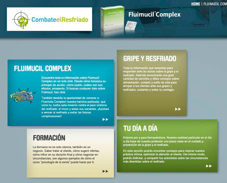
Make it useful, easy-to-use, and interesting, and your clients will then listen to your message.
Technical details of a private pharma portal
In this project Ilusionlabs carried out the interface design, while Swahili Studios developed the games, and I took care of all the coding of the portal.
The platform chosen for this development was a heavily modified WordPress engine, mostly because of the CMS nature of the project and server/timeframe constraints. Once extended using several custom-created OOP modules, it was hard to recognize the vanilla engine in it.
First, it was necessary to implement a restricted access system, where users with different user roles would have different permissions. Administrators should be able to access all functions, editors would only generate more content, and users would just browse published content.
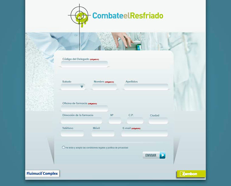
Then, the system was prepared for advanced stats tracking. That way the performance of the different sales teams bringing in new users could be assessed, and the sections could be optimized according to our final users’ attention. This was achieved triggering custom navigation events, referenced to the information logged users would provide when subscribing.
Presenting the right content, the right way, is absolutely essential in a system like this. Every different section had a different format and layout. Loading new contents in the system was made as easy as possible. The control panel of the users was repogrammed to include as many custom fields as the current section would need. Then, every category contents would be printed and formatted according to its unique theme, in an automated way.
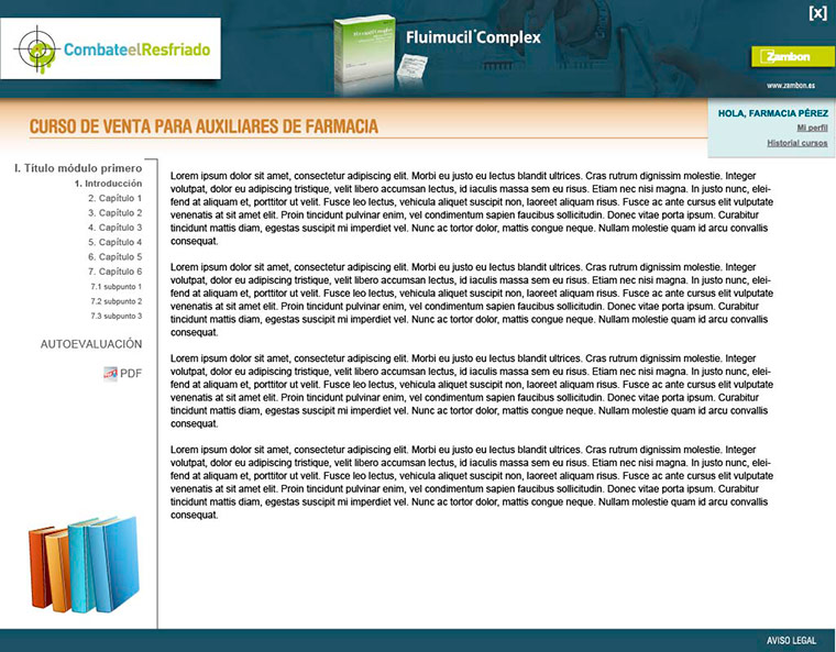
A rich e-learning experience was created as one of the main features of the system. Editors would easily craft complete selling courses, that would be very welcome by our audience, and the page would display their special navigation structure, and even print self-evaluation tests and grade tracking.
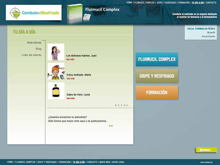
The idea was to create a user community that interacted together, and that is why a members-only blog related area was programmed. Users would be able to submit their own anecdotes, and to share them with the community as well.
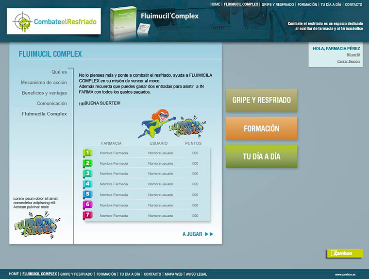
Then, what can be more atractive than a game and a contest? Built around the theme of the main product that the company wanted to promote, a game and a reward are a sure way to keep people’s attention. It’s the essence of gamification. The system I programmed would track the scores of the users across three different games, combine them in the database, then elaborate a ranking, and select the winners of every season, who would in turn get free tickets to a pharma-related conference.
Finally, a simple e-mail newsletter creation platform was coded as an integrated part of the system, since it was a way to keep in touch with the latest news and releases, taking advantage of the enganged user community that the system created.
In essence, this system was a very complete portal, that made possible to carry out a smart marketing strategy. User-friendly and intuitive, it just made my client’s job as easy as possible.
