
Images that draw you in
What do we find so fascinating about traveling? It’s probably how we’re drawn into new experiences, how we’re attracted by different landscapes. And that’s what makes having a unique tone, and displaying beautiful images, key elements in a website that revolves around journeys.
Geri Dreiling is a talented writer who wanted to share her travel experiences with the world. She had a very clear idea about the kind of website that she needed. “I want something that looks happy, Enrique” – she told me.
In the first phase of the development, I designed an interface incorporating a complementary color scheme that reminded of sunny skies or beach days: a bright blue blent with a warm yellow-orange.
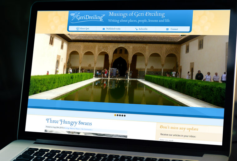
This design combined pretty well with the logo I had created for Geri: the symbol of a hummingbird with a pencil. What could better express the nature of a creative, energetic writer? We made sure to make this logo stand out on every page, as making her brand memorable was essential to reinforce the unique tone of her travel blog.
The result was a website full of charming images, with a very well defined personality.
Traveling to responsive lands
The world of website technology has been moving fast during these recent years. Mobile traffic skyrocketed among our users not long after the first version had been installed.
Geri Dreiling’s site was already well-known. We didn’t want to start it over, chasing the last trend of minimal flat designs. Geri’s priority was to keep her style and brand. But making the site mobile-friendly was now essential.
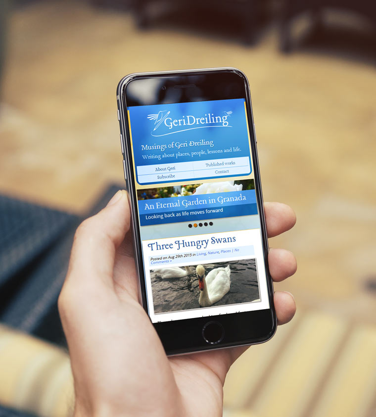
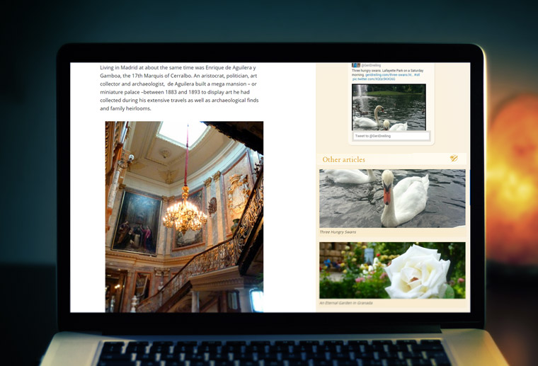
Responsive design was our next destination. I drafted alternative layouts that would work well for different devices, including phones and tablets of pretty much any size. The original look and feel would be preserved, but the texts would remain easy-to-read, and the images would be displayed using as much screen real estate as possible.
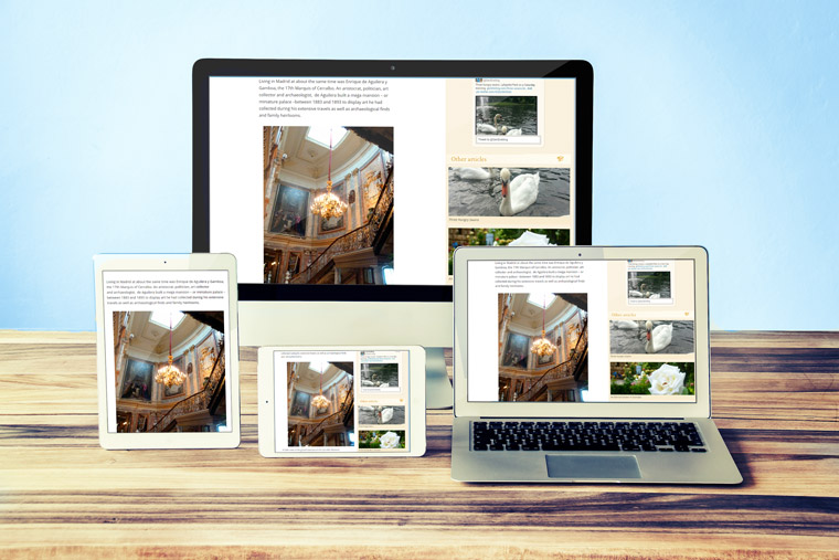
We took advantage of this upgrade to enhance other areas of the site. Since travel images are so attractive by themselves, we decided to make more with them and include image-based links, that proved to engage our users longer, while reading related articles.

At the end, Geri’s blog looked good in any device and kept a unique flair and style that matched her distinctive writing tone.