
Alpha Elevators engineering logo design: tech arrows logotype design for an engineering company, by Enrique Serrano
Key ideas of the Alpha Elevators engineering logo design
Alpha Elevators is an engineering company that installs and repairs all kinds of elevator systems.
The logo design depicts a modern looking “A” (alpha) symbol that somehow reminds of a pointing up tech arrow design.
A custom technology font design complements this elevator engineering logo.
Customer’s engineering company logo design requirements
- Alpha Elevators was seeking a business professional logo design that could represent an open-minded, creative, young but trustworthy engineering company. The logotype design will be used on the elevators and on all of this engineering company branding.
- An “A” symbol (representing the “Alpha” idea) could be used in the logo design. The symbol has to be distinctive enough as to fully work on its own, with no additional text. So no topic arrow symbols may be used.
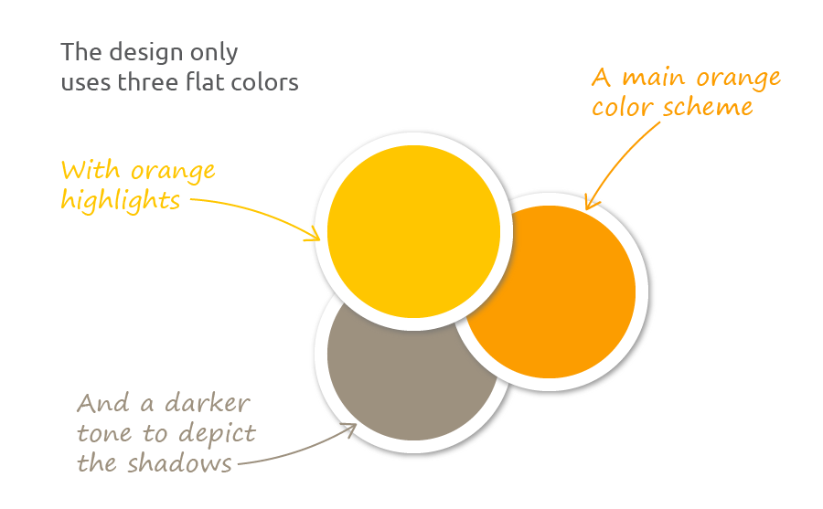
- There are no corporate colors already defined, so any color scheme may be used in the logo. Limit the colors used in this design to a maximum of 4 flat tones.
Why this “A” Alpha tech arrow logo design works
The main idea was to design a very original and distinctive “A” (alpha) logo symbol that would help to remember the company name: Alpha elevators. Also, an uppercase “A” letter has a strong similarity with a pointing up arrow. This fully custom design of the A logo is totally different from a topic or cliché arrow symbol, but still shows an idea of rising and elevators.
![]()
As this is a modern engineering and elevator installation company, the logo symbol should have a somehow industrial tech feeling. So the “A” logo was designed as modern pieces that fit together, conveying this industrial engineering concept. This main logo symbol is depicted as a solid and big structure (remarked by the shadow effect), depicting a professional and trustworthy image.
To convey a somehow young and open-minded feeling I chose a bright orange tone. The result is an eye-catching color scheme, strong and vibrant, that is still appropriate for a trustworthy and professional engineering logo design.
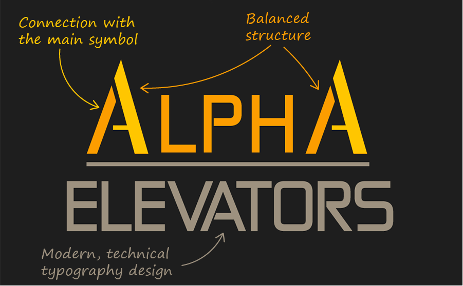
The engineering company name was written using a strongly customized tech-looking font. An uppercase text was used, to strengthen the big and professional features of the company.
The “A” letters of the very company name use the same main symbol of the logo, making the desing fully coherent by linking the standalone symbol with the logotype text and the engineering firm name. The whole logo design has subtle references to arrows pointing up, which convey a subtle idea of rising and elevation.
The whole logo design of this engineering company efficiently combines ideas of elevators, engineering and technology, with a modern and open-minded (but also professional and trustworthy) feeling.
Other Alpha engineering logo design variants
![]()
White background Alpha logo design
The main proposed logo design used four flat colors (taking into account a black background). I chose a black background because it highlighted the bright orange arrow logo, so this whole engineering company logo design would stand out even more.
But the Alpha engineering logo design also works on a white background (which could save one color when printing on a white paper), as this logo version demonstrates. This Alpha elevators logo design will work perfectly on different surfaces with no additional color changes.