Orson Systems logo design: construction software engineering logo designs by Enrique Serrano
Main ideas of this software engineering logo design
Orson Systems is a software engineering company specialized in the construction sector.
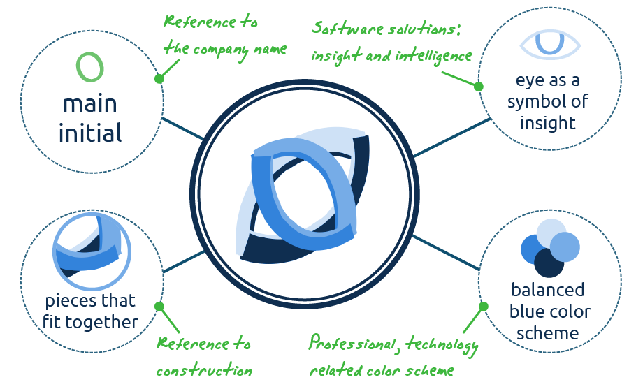
The logo design depicts a modern “O” looking symbol with an abstract technological and constructive feeling.
Requirements of the construction software engineering company about the logo design
- The idea is to create a simple and professional modern construction logo design, appropriate for a software company. The design should not be too complex.
- Any symbol may be included, but avoid specific construction or software engineering logo symbols.
- Any color scheme may be used in the logo. Limit the colors used in this design up to 4 different colors.
Why this software engineering logo design works
This logo design is based on the initial of the software engineering company name, “O”. Taking this as an starting point and considering that it’s a software engineering company specialized in the construction sector, a modern, compact and tech-looking symbol would be appropriate.
So the main symbol of this logo reminds of an “O” letter, but it’s also an interesting structure. The interconnected pieces create an eye-catching shape that reminds of something “construction related” in an abstract way, as the design pieces fit together. The angle layout adds a dynamyc and interesting feeling to this original logo symbol too.

The main purpose of a construction software application is to get information about the process, to gain insight about it. And this is also represented in some way in this logo design. This logo symbol could also be seen as an eye-looking shape. The eye shaped design adds an smart touch to the whole logo, as well as a software engineering company may add intelligence to construction related software applications. So this fact, combined with the 3D pieces that fit together, makes the logo meaningful for both key company aspects: construction and software engineering.
This logo uses a four blue colour scheme, which is both technological related and professional. The corporate identity design remains serious and trustworthy, while conveying a modern and advanced company image.
A nearly high tech font complements the logo design: it’s bold, modern and easily readable. Writing the whole name in an uppercase font, and using a dark blue color scheme, strengthens the serious and professional software engineering corporate identity. The subtle light blue details in both “O” letters add a smart touch to the typography, and are closely related to the main logo “O” symbol concept, making the whole logo design coherent.

A tech looking eye catching “O” logo symbol was created: an appropriate design for a modern construction software engineering company.
Other logo designs for construction and software engineering

Modern colors logo design
This logo version features a bright and modern color scheme based on blue and green tones. This combination of complementary colors is very contemporary and techy, making this logo design appropriate for a modern software engineering company.
Nevertheless, the final logo version followed a more professional and sober tone. So this modern color was a trade off between some of the very serious and professional properties of the final logo and vivid colors, to become a little bit more eye-catching.

Simpler logo version
This logo version keeps the main concepts that made the original design a meaningful identity for this software construction together, but goes ahead with an even simpler logo version which still keeps an “O” symbol, with a smart eye looking feel, and a constructive approach of segments that fit together.
This crisp and clean logo symbol is just composed of two flat colors and looks great on a dark background. Moreover, the logo text now has a subtle 3D feel too, which remarks the high tech construction and software nature of the company.
So this design is extremely serious, clean and professional, conveying a technology, modern software engineering corporate identity.


