
Phoenix bird logo design: bioengineering science logo designs by Enrique Serrano for the Atlanta Project
Main ideas of the Atlanta Project phoenix logo design
The Atlanta Project is a bioengineering science project with medical and health objectives.
This logo depicts a requested phoenix bird symbol, in a way that resembles bioengineering, science, high-tech, caring and well being.
Bioengineering company logo design specification
- The chosen image for the Atlanta bio-science project is a phoenix bird, so this mythical symbol is required.
- Due to the medical project nature, the phoenix logo symbol should not be stark, aggressive or intimidating. Instead of that, the phoenix bird has to be designed to convey a feeling of caring, health and well-being.
- As it is a bioengineering project, the logo style should have also a modern, science and bio-technology feeling.
- The logo design may use any color scheme. Three different flat colors is the color limit in this logo design.
- Any clearly readable modern font may be used. The codename of this bio-science project, “Atlanta”, has to be part of the logo design, not being case sensitive.
Why this bio-science phoenix logo design works
The key idea of this logo design is to depict high-tech, health, caring and well-being feelings in the shape of a phoenix bird logo, staying away from stark or even aggressive depictions of this mythical bird.
The first challenge was to design a phoenix, avoiding any intimidating elements. A phoenix is supposed to be a mythological creature that rebirths from its own ashes. But, in this medical bio-science project, elements such as fire, ashes or flames would be rather inappropriate, as those ideas could hardly be associated with caring or well-being feelings. So this phoenix logo design is based on a very different and clever approach: the phoenix rebirth is depicted in a calm, clean way, as a smart bird that raises from crystal clear water.
![]()
Another challenge in this logo design was to create an appropriate posture and style for the phoenix symbol. As it is a modern bio-science project, I thought that a logo design based on clean lines would work – it has a subtle technology feeling, without being too impersonal or stark. Then, the phoenix was designed in an inviting and appealing open wings pose, to strengthen the “caring” and “well being” feelings of this logo. It conveys a sensation of being rising in a gentle way. The phoenix face expression is determined and cunning: an appropriate stance design for health science investigation.
Only one flat color, with a percent variation for the reflection effect, was used on this logo design. Red, fire-related phoenix colors were discarded as they could be somehow aggressive. The blue color scheme chosen perfectly fits the nature of this bio-science project: it’s not only an appropriate color for a modern science design, but also for a health and well being related phoenix logo.

An uppercase approach for the “Atlanta” project name was chosen in order to convey an idea of strength and promising bio-science project. The logo font is a sans-serif typography, based on straight lines, with a subtle modern feeling: it avoids being too techy or naive, but it still is somehow modern, science related, and can be associated to caring and well being. Also, as the project name “Atlanta” is nearly a symmetrical word, so matching the sizes on the first and the last letter gives an interesting dynamic feeling to the logotype, and it keeps the whole composition balanced as well.
The final logo design features a smart, modern, clean and inviting phoenix design, very appropriate for a bio-science logo, that substitutes any stark or aggressive phoenix related features by caring, health and well-being feelings.
Other bio-science phoenix logo design variants
![]()
The Rising Phoenix logo design
This is a different logo design approach, prior to the final phoenix rising from crystal clear water. It depicts a rising phoenix bird in a way that reminds of a traditional medical symbol (as a nod to the Hermes Rod or Caduceus, which is actually a reference for the Rod of Asclepius,) conveying a sensation of “smoothly soaring phoenix”.
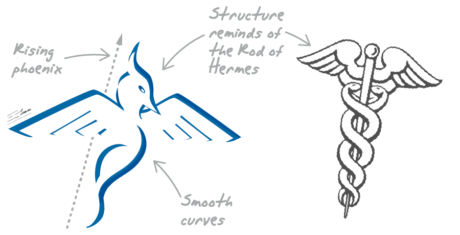
The phoenix symbol requires just a flat color, without any ink percent variation. But I finally preferred the phoenix rising from the crystal clear reflection, as the design is more eye-catching, and the logo is more compact, which eventually will make it easier to use.
![]()
Dark back phoenix logo design
This is a variation of the main phoenix logo, designed to work on a darker background. Again, this design requires just one spot color, with an ink opacity variation for the crystal water reflection effect. This means that the logo will be extremely easy to print, while staying appealing and eye-catching.
The bluish tone of the background, combined with the white lines of the phoenix logo, keep that well-being, health, caring and bio-science mood of the logo design.