
Server .biz logo design: web server logotype designs for an Internet web hosting company
Key Internet Web Server logo design ideas
Server .biz is a web hosting site that offers Internet web hosting services.
This logo design depicts a web hosting site Server logo: a structure like an interconnected array of computers, with fast internet connections.
Requirements of the Internet web hosting company about their web server logo
- The logo should be of a modern and professional design style. It has to convey that this web hosting company is a big and strong one.
- A standalone web server logo symbol may be designed. It has to be a fully original symbol design, recognizable on its own, without any other logotype text.
- This logo design is not only going to be used on the website, but also on every other company communication element, such as stationery, letterhead, business cards, products, etc. So there is a color limit of just two flat colors for this web server logo design.
Why the web server hosting logo works
The key was to design a fully original web server logo that took into account the ideas of fast internet connections, web hosting and interconnected computers.
The fast internet connections provided by this web hosting company are depicted as dynamic thin lines that expand from the core of this logo. It conveys the idea that the main server structure of the logo design is connected to the Internet through multiple fast web connections.
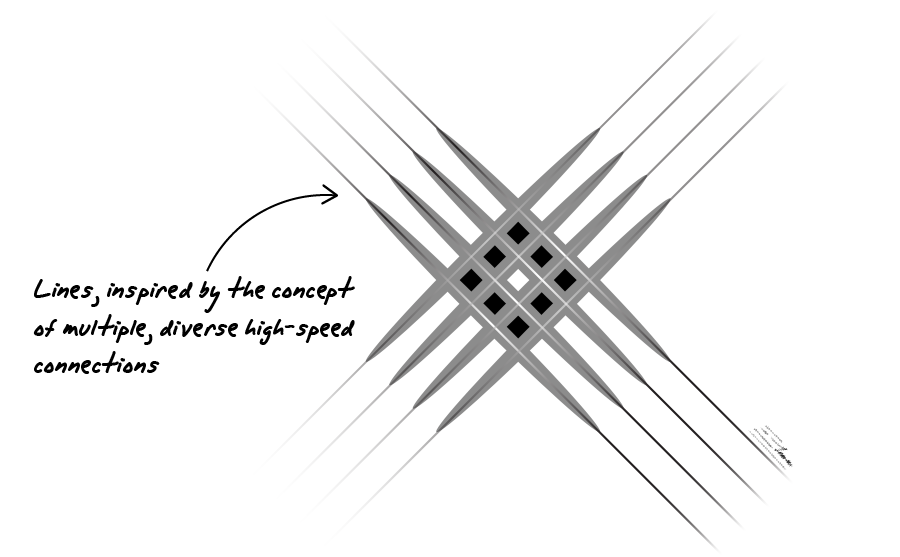
The kernel of this server logo is a square structure that depicts a web server. The web server idea is the key of the company identity, and so it had to be the main logo element. The server connection lines act also as arrowheads that point to this central element of the design, catching the viewer’s attention on this web server concept.
The ideas of web hosting are depicted including smaller squares inside the main server logo. These small elements convey the concept of web applications contained inside the web server structure, and connected with the Internet through the fast connection lines.
![]()
A serious black and gray color scheme was chosen for this server logo design: it’s a very sober, clean, modern, and technology related color scheme, very appropriate for this internet web hosting company, whose main priority is to convey the professional image of a big experienced web hosting firm.
![]()
Finally, a clean font with subtle interesting details complements this server logo design, mixing professional and modern features without becoming too techy or hard to read.
The definitive web hosting site Server logo design conveys a professional and modern image, taking into account the key concepts of the customer’s web hosting business: a web server, fast internet connections, and web hosting services.
Other web server logo design variants for the hosting site
![]()
90º web server logo design
This is a former version of the final web server logo design. It’s exactly the same design as the definitive logo, but this time the lines that depict internet connections were placed as horizontal and vertical lines forming 90º between them.
This is a solid logo design which keeps the same ideas as the final logo. I finally preferred the final 45º rotated logo as the design looked more dynamic. That way, the lines on the four edges also look like arrowheads pointing to the central server logo, remarking the server concept.
![]()
Compact web server logo design
This is a variant of the previous logo version. This time I designed a more compact server logotype version. The compact server logo still keeps the main design ideas, but now it’s even easier to print and recognize at small sizes.
On the other hand, this compact version loses some of the “fast connection” ideas by cutting the length of the outer lines. So I discarded this version as I thought that keeping the idea of fast internet connections was important for an internet web hosting business, and the main original version of the server design was chosen instead.