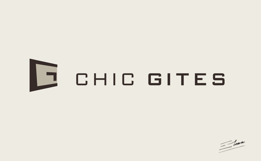
Chic Gites logo design – a luxury logotype created by Enrique Serrano
Key logo design ideas
Chic Gites is a company that rents luxury apartments in the South of France.
This Chic logo design depicts a modern “CG” symbol that reminds of an inviting open door.
Customer’s company logo requirements
- The customer wanted a very simple and clean logo: easily resizable and recognizable.
- The font should be easily readable and it should also be based on square lines.
- Any apartment or building cliché symbol should be avoided.
- The corporate colors chosen were a light beige and a dark brown.
Why this logo design works
The original “CG” symbol is related to the luxury apartment concept as it looks like an inviting open door. So this unique symbol reminds of the company name in an appealing way, and stays away from overused topic logos at the same time.
The chosen font is straight-line based and is easily readable even when printed at small sizes. Clean and appealing at the same time.
The image uses only two flat colors over a beige background. A warm and elegant color scheme, easy to print, and easy to recognize.
Strong luxury logo designs don’t need over the top flashy details. The chosen logotype is simple, but it is still distinctive, high-class and original.
The resulting brand image of these Chic logo designs is a simple and clean luxury logotype.


