
Real Estate Sales Team logotype design – A clean real state iconic logo
Key logotype design ideas
This logo design was created for a group of vendors working with the Re/Max real state company.
What this logotype design depicts is real estate sales team, working together, in a clean and iconic way.
Customer’s company logotype requirements
- The logotype should be clean, crisp and eye-catching. So the logotype has to stand out and be easy to read at the same time.
- The sells team nature of the company should be emphasized in the logotype.
- The logotype should depict a vendor team that works together to sell houses quickly and effectively.
- The real estate franchise corporate colors, red and blue, must be used. A sunshine yellow color could also be added to the logotype.
Why this logotype design works
![]()
This logotype design is a crisp and clean representation of a real estate sells team working together. The group of vendors is depicted as a strongly united sales team in an iconic way. This bold and compact people image, together with the perspective effect, gives an idea of a well structured, professional and advancing team.
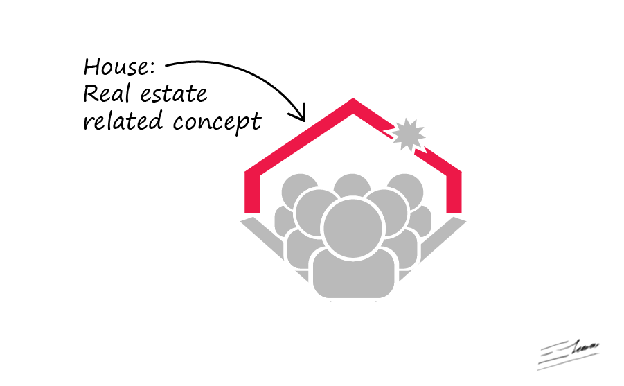
The silhouette of the house in the background conveys the real estate ideas of the logotype.
Since it is a real estate company, the logotype could be printed on a wide variety of surfaces, such as wooden signs. It had to attract the attention of even a driver or a passerby. And it had to convey an idea of “real estate company” so the sales team won’t loss any potential customer: they will immediately recognize the symbol and realize that such house is for sale. This is achieved because that the logotype is eye-catching, meaningful, and easy to identify.
So, as this logotype has to be easily readable and recognizable, a simple structure and a clear font were a must. The result is that this logotype can be seen and identified even from a long distance. It has been designed to catch the viewer’s attention and to convey a idea of real estate company even from the very first glance, due to the simplicity of the logotype symbol.

The logotype uses the exact red and blue real estate franchise colors, which remark the brand image. A sunshine yellow was also added, as it emphasized the real estate company slogan: “experience that shines”. That explains the shining effect on top of the house logotype, which gives also an outstanding feeling to the house being sold. The resulting color scheme of the logotype makes it extremely visible and eye-catching as well.

So the logotype symbol as a whole looks like a succesful real estate sales team, a group of effective vendors that work together, realtors who proudly stand before a good quality house quickly and efficiently sold. It’s a very clean, visible and easily readable logotype at the same time.