
Big Wave project logotype – disabled caring logo design by Enrique Serrano
Key logo design ideas
Big Wave group is a private funding project that provides caring and develops programs to give new opportunities to disabled people.
The Big Wave logotype design depicts a modern conceptualization of a bridge rising over a big wave, representing the connection between the past and the future, in a very modern and nearly futuristic way.
Customer’s company logo requirements
- The logo should be very modern, with a nearly futuristic style. They wanted to provide a totally new vision of disabled people and to remark the new opportunities that they can provide.
- The logotype may include a big wave symbol, as well as a bridge symbol, which represents a connection between the past and the future of disabled people.
- The logo image should convey feelings of caring, group and community.
- The desired logo color scheme must include an ocean blue color. It should also include warm earthy colors. A black version over white background should be provided for printing purposes as well.
Why this logo design works
This logo symbolizes a bridge over a big wave, in a very modern and conceptual way, almost futuristic. I thought that a rounded shape would be very appropriate, as such soft lines convey feelings of caring, while the circular concept can be used to depict groups.
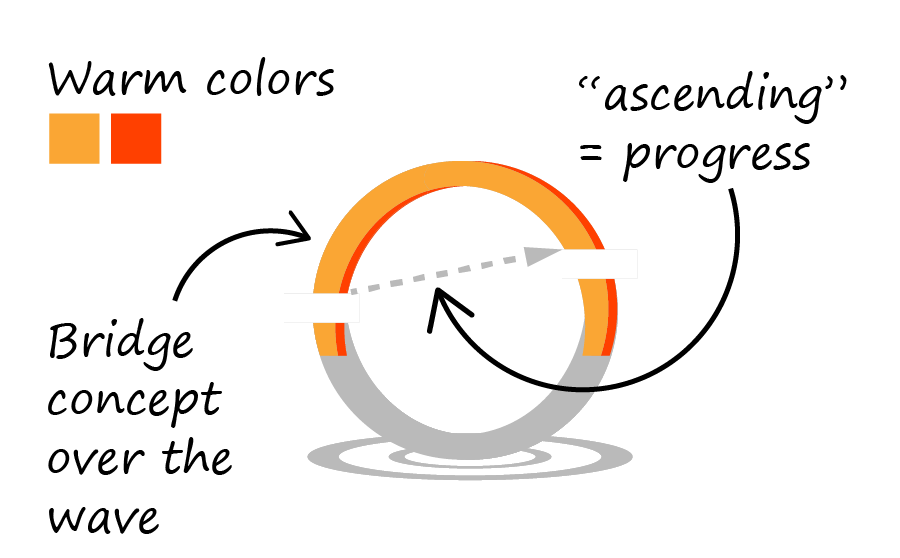
As the customer wanted to convey such abstract concepts as progress, change and evolution, I added some empty space cutting the edges of the bridge, so it gives an idea of motion, of construction, and of progress. It looks like the ascending bridge shape is being built, and just leaping over the rising wave, connecting two formerly distant edges.
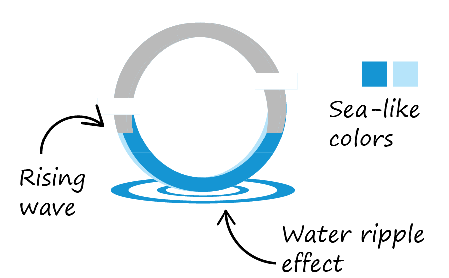
I didn’t want to miss the opportunity to remark one of the most distinctive features of the Big Wave project: giving new opportunities. This abstract concept can be approached making the logo look like a new appearing symbol. Such concept is partially addressed by the newly constructed bridge. And this also the logic behind the water ripple effect at the bottom of the logo. That way the whole logotype symbol looks like something new that is emerging. And such ripple effect highlighted the oceanic and wave concept as well.
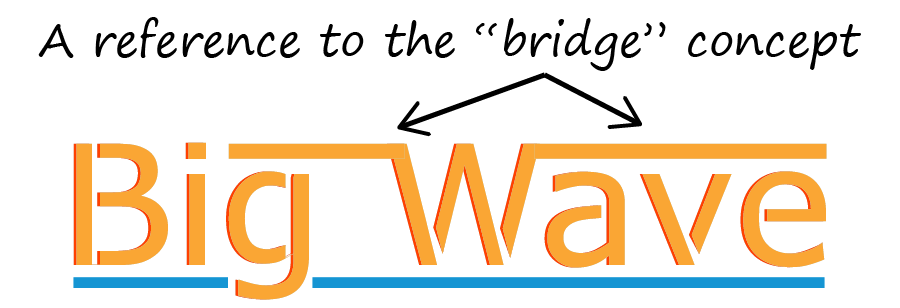
The easily readable customized font chosen has a nice futuristic effect due to its clean straight lines and cut edges. The blue underline remarks once more the ocean and wave theme, while the top lines of the “W” letter remind of the “bridge” idea.
I finally chose a 4 color scheme that incorporated ocean like blues, together with complementary warm colours. This earthy warm touch is a nice detail, as it reinforces the caring idea, preventing the logo from looking too cold. The whole resulting design was simple enough to work in a black and white version, making it easy to use.
The emerging bridge over the big wave gives a futuristic idea of group, progress and new opportunities. It has a modern professional look, without becoming too stark.
Other logo design variants
![]()
The black & white big wave logo
This is the black and white version of the final big wave group logo. The main big wave logotype shape is simple and clean enough to be easily printable in just black over a white background.
I always think that having a very simple black and white version is a good idea. That way you can print an effective version of your corporate image even in a fax. And this is specially true when your main logo is composed of more than 3 colors, as it may become hard and expensive to print in several media.
![]()
The circular big waves logo
This is a more complex version of the main big wave logotype, which remarks the “wave” concept. I wanted a logo variant that focused on something like “change” and “emerging new opportunities.”
So I designed the central circular wave symbol mixing the big wave ideas with a dynamic motion like circular wave shape. Besides the resulting logo may be a little busy, I still like the futuristic look and feel of this symbol.