
Embryo Dynamics (cellular computer animations) logo design by Enrique Serrano
Key logo design ideas
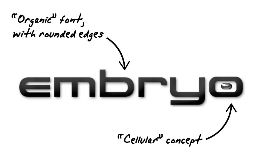
Embryo Dynamics is a company that creates computer generated pixel animations of evolving cellular embryo.
This logo combines both key concepts: an organic cellular part (embryo) with a computer pixel animation related part (dynamics).
Customer’s company logo requirements
- The logo style should be clean, light and precise.
- The logotype should represent dynamism, line art and pixel animations.
- The two separated parts of the logo (the embryo logo and the dynamics part) should be emphasized.
- A lowercase font should be used.
- A grayscale color scheme is preferred, but the logo may contain gradients.
Why this logo design works
One of the essential points for this design was to create a very clean and precise logo. Since simplicity was such an essential matter, I decided to develop an all-text logo in this case, with a unique depiction of both parts of the company name. So I created a different custom font for each part of the logo. The idea was that each font would depict the main features of the written word.
The embryo logotype part is related to evolving life and to the cellular concept. That’s why it has a more organic look due to its smooth curve lines. The dot inside the last “o” strengthens even more this cellular concept, as it looks like a single cell or even an embryo.
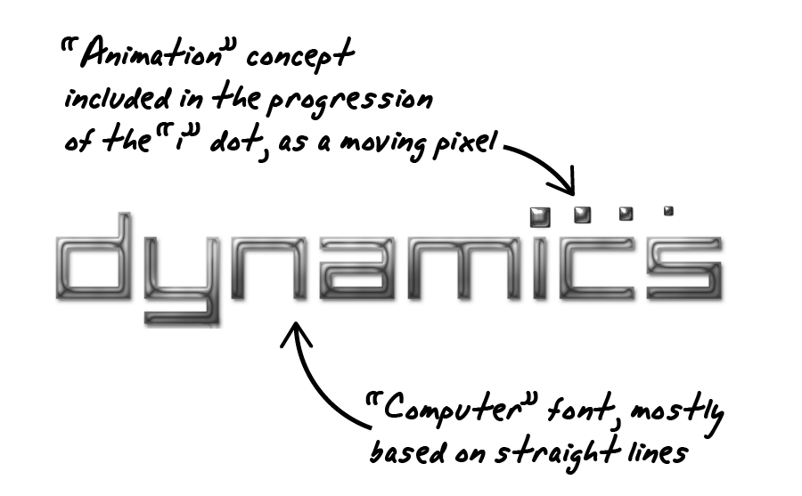
On the other hand, the dynamics part of the logo should depict line art and computer generated animations. So I designed a computer font based on straight lines. The dot sequence over the “i” reinforces the concept of pixel animations and computer generated pixel simulations, as it looks like a moving or evolving pixel.
Finally, the grayscale color scheme used complements the clean, sleek and precise concept of this logo. The gradients and reflections add very eye-catching features to the logo design, which would look great at a webpage. But a 2 flat colors grayscale version was also provided in order to have a printer friendly version too.
![]()
In a nutshell, this logo is extremely clean and simple, but each part is full of meaning at the same time.
Other logo design variants
![]()
The black background logo version
This is just a color scheme variation of the previous logo. It’s still based on a grayscale color scheme, but the lighter colors of the logo text make it specially suited to use on dark backgrounds.
The main idea that inspired this design was the concept of the first personal computer screens, which featured white, pixelated text over black backgrounds. This is an approach that blends quite well with the pixel-based graphics concept.
While the white background version created something like a precision computer laboratory feeling, this dark background variant has also a smart high tech look. However, I finally advised about using the lighter background version as the main design version for being more practical: when using logo designs in real life, you realize that most of the time you’ll have to make them work on white backgrounds, since they are the kind of backgrounds that you will encounter more frequently.