
More Hair salon logo design by Enrique Serrano
Key hair stylist logo ideas
More Hair! is a beauty salon that uses advanced techniques to maintain healthy growing hair.
This More Hair logo is based on a very original, modern and distinctive symbol that reminds of healthy growing hair.
Customer’s salon logo requirements
- The logo should represent natural hair growth, vibrancy and strength.
- The logo should use up to 4 colors. The colours should complement a pumpkin color scheme.
- The symbol must be able to stand alone and to be recognizable without the company name. No hair styling tools may be used in the logo.
Why this logo design works: the hair salon logo ideas
The logo is based on a very original bold symbol that reminds of growing, strong and healthy hair.
The growing and smooth hair lines convey a strong flowing hair feeling.
The bold font chosen perfectly matches the professional and healthy look and feel of the salon.
The “More Hair!” part of the logo focuses on this strong concept. Then, the spaced “salon” text flows nicely balancing the composition.
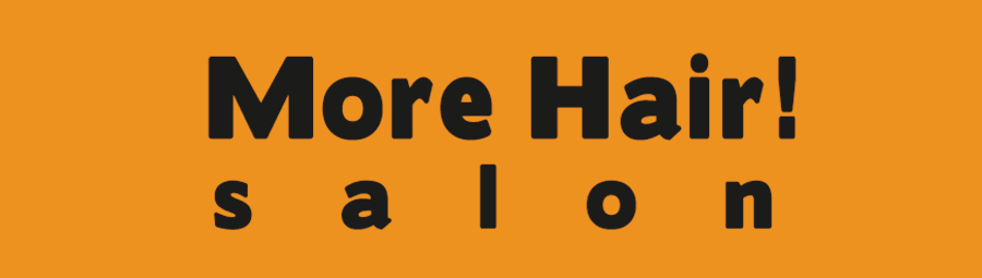
This logo uses just only a black color on a yellow pumpkin background. It makes the logo image very strong, visible and easy to identify.
The final logotype is a very strong and original hair symbol that could perfectly work as a standalone icon.
Other logo design variants
![]()
The colorful growing hair logo
The first beauty salon logotype was very strong and easy to identify. But, as there was a color limit of 4 flat colors, I decided to create a more colorful logo version.
So this four color version adds a more intense growing hair effect due to the color transition of the individual hairs. The different colors used help those hairs to look even longer, increasing the natural hair growing and flowing effect.
![]()
However, the main objective of this design was simplicity. Hence, the final version, based on the silhouette of the design, makes an even cleaner logo, that reminds of a head with stronger hair, or of a single hair strand with additional hair added – which is actually the successful outcome of the treatments offered by such hair salon.
The meaningful and clean nature of the original design made it the best idea for this scenario.