
The framed M – fashion photography studio logo by Enrique Serrano
Key logo design ideas
The Melissa Miller photography studio is a modern and creative photography studio.
This logo design is a framed double “M” symbol which combines both key concepts: the photographer’s name and a photo frame looking symbol.
Customer’s company logo requirements
- The logo style should be modern, sleek and appealing.
- It should stay away from a very traditional image: a more fashion approach is desired.
- Topic photography related symbols, like cameras or films, should be excluded from the logo design.
- The logo anagram should work even as a standalone symbol.
- A simple script font for the logotype text is preferred, but without being too cutsey or busy.
- The logo should use up to 5 colors, without any gradient.
Why this logo design works
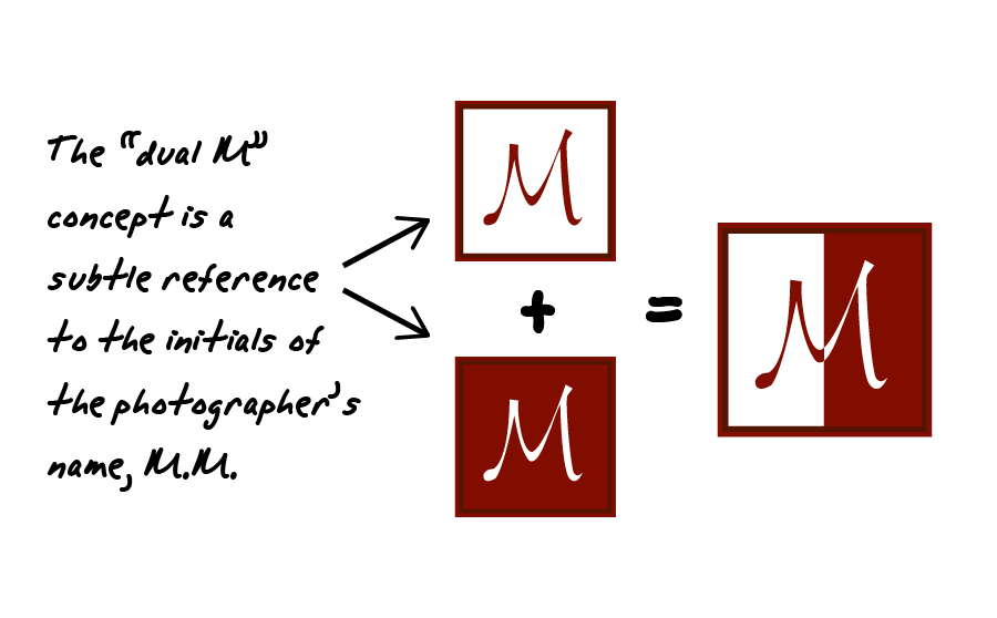
This logo focuses on the photographer’s name and on the modern photography concept. The main symbol of the logotype is a “M” split in two parts, each one representing the photographer’s name initials.
This overall logo symbol reminds of a photography frame in a quite abstract way. So it also reminds of a photography studio, and avoids photography topic symbols as well.
![]()
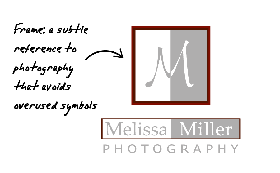
The font used in the anagram of the logo meets the customer requirements: it’s a modern script font, but it isn’t too ornate or cutsey. This “M” logo adds a lively and dynamic effect to the whole composition. On the other hand, the photography studio name was written using fonts which are easier to read. That makes the company easily recognizable, while balancing the overall composition and keeping a professional fashion corporate image.
The final version of this logo is composed of just two flat colors. In fact, both the logo anagram and the logotype text achieve this thanks to a smart use of the white space of the background. Keeping the number of colors in the graphic under control is a good way of decreasing print costs and of making the whole corporate image even easier to recognize. Finally, the warm color scheme used conveys a trustworthy and professional image, which is also appealing and inviting.
The double framed “M” combines a professional image with a creative and appealing touch, being nearly a fashion symbol logo, while staying simple, original and photography related.
Other logo design variants
![]()
The soft dual M logo approach
This logotype approach uses the same idea that the final logo: a dual “M” symbol that represents the initials of the photography studio owner. This concept actually started from a circular approach, as that is a balanced, soft shape, loosely inspired by the lens of a camera. Then the “M”-shaped script was included as part of it.
However, it was finally determined that a photo frame concept would have an even stronger symbolism related to photography. And so I finally added the photographic frame concept, changed the color scheme to 2 warm colors and selected easy to read fonts for an even more meaningful and cleaner resulting logo.