
Electricity icons design: Energy logotype designs for an industrial power company, as electricity logos
Key ideas of the electricity icons and power logo design
S.E.T.M. is a company that provides services for industrial electricity such as installation, maintenance or industrial design.
The electricity icons designed, together with the tech font, create a logo that depicts modern technology, power and energy.
Industrial power company requirements about the energy logo and electricity icons
- The design style of this industrial power company has to be modern and technological.
- The idea is that the logo design should depict technology and energy. Any symbol may be used in the logo, such as electricity icons or similar.
- As this logo is going to be used on all the company branding (letterhead, business cards…), there is a maximum color number of three flat colors.
- Any font may be used in this logo design. A technology related typography is preferred.
Why these electricity icons and industrial power logo designs work
The key idea was to create an electricity icon as the main element of the logo design. It had to be an original logo symbol that depicted the ideas of technology, electricity, energy and power. So I designed an electricity icon based on a central power source. Then, the energy spreaded from that electrical energy core in a bright and powerful way.
Once the power concept was defined as the core of this electricity icon, some more industrial and technology ideas were added to the logo through the containing triangular design. By enclosing the energy rays inside a triangular structure the logo conveys also an idea of electricity and power under control.
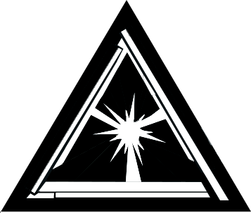
The key of the electric meaning is in the spark, which also accepts other simplified variants. The triangle is composed of three pieces with an industrial equipment feeling. And the fact that there is a little gap between those pieces gives also a more dynamic feeling to the electricity icon of this logo design.

A strongly customized typography was used to depict the main logo text. I wanted to strengthen the industrial feeling and so I designed a font with an electric transformer look, made of shining metallic panels. The result is a very technologic and industrial logotype.
I chose a blue color scheme for this logo design. This blue color gives an industrial feeling to the logo (like a blueprint) and remarks the electric icon and power concepts (due to the contrast of the shining white sparks). It’s also worth noticing the simplified metallic shading achieved with three flat colors on top of a solid background, with glow and shining effects applied on this logo design. So this electricity icon design is very bright and eye-catching, but it’s still easy and affordable to print at the same time, even using precise spot colors.
![]()
The final logo design features an electricity icon and a modern industrial feeling that clearly states what this company is about: industrial electric installations and other energy related services. So the logo design conveys a clear and eye-catching idea of technology and power.
Other industrial electricity icons & logo design variants
![]()
Grayscale electricity logo design
Having a printer friendly logo design is always a good practice when creating a new corporate identity. As the main electricity icon and industrial power logo design was simple and clean, it was easily converted into a grayscale logo version that keeps that shining electricity and energy effect.
This logo version uses just plain black and white colors, plus only a gray tone. So it can be easily printed in nearly any device. I specially like the metallic effect of the industrial typography of this logo design, still achieved with such a limited color palette.
![]()
Electric circuit text logo design
This is a different design approach for the logo font, and an upgrade on the original design. While the main version font remarked the industrial concept, I also thought of a different font based on a power and electricity concept. So I designed this electric circuit inspired font, simpler, blent together, but still very modern, and with a clear emphasis on an electric symbolism.
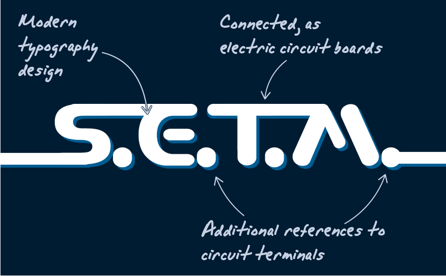
The result is a typography design that perfectly fits the requirements of this industrial power company. This subtle reference to circuits is even cleaner than the other design approach, and perfectly fits the theme of the main electricity icon in the original logo.