
Adjust the contrast of the metal effect using Levels in Photoshop
After creating the right lighting effects, we are going to make some simple Photoshop contrast adjustments to render an even more realistic metal texture. Let your metallic effect shine!
Adjustment Layers
For both adjustments, Levels and Curves, we are going to work in separated Photoshop Adjustment Layers. Using such special layers has the following advantages:
- The image pixels are unaltered, so you can always revert your original metal texture.
- The parameters of the adjustment layer remain editable.
- Adjustment layers nearly don’t increase the file size at all.
- You can paint the layer mask to control the adjusted area.
- The intensity of the color correction is easily controlled by changing opacity value of the adjustment layer. If you think that your contrast adjustment is a somehow over-the-top, just decrease the adjustment layer opacity a little bit.
To create an adjustment layer just click on the adjustment layer icon at the bottom of the layers window, or select Layers > New Adjustment Layer from the main menu bar.

This is our starting point: a star with metal texture that seems low on contrast and a little bit washed out.
![]()
Click this icon at the bottom of the layers window to create a new adjustment layer.
![]()
We will create a levels adjustment layer to tweak the image levels in a non-destructive, editable and controllable way.
Levels in Photoshop
Photoshop Levels are optimum for overall contrast optimization. This tool allows you to see in a histogram how many image pixels have a specific brightness value. Then you can remap the whole image pixels to take advantage of the fully dynamic range of the image, enhancing the image contrast.
The darkest pixels are on the left of the histogram, while the brightest pixels are on the right. The left levels slider controls the black point, and the right level slider controls the white point.
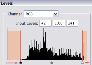
Adjust the levels by dragging the sliders. Leave away areas with no or very few pixels till the final contrast seems ok. Don’t overdo the adjustment trimming away areas with many pixels.
So let’s make it simple. If the histogram seems to have empty edges, you have to trim them away. That will expand the histogram to avoid wasting those unused brightness levels, and your image will be much improved by an easy levels correction.
Just drag the sliders under the histogram, leaving out of the selection the histogram areas with no pixels (or very little pixels) of such brightness level.
Remember that cropped values will be mapped to pure black or white. So don’t cut away many levels or your image would look overexposed, underexposed or too contrasted, losing part of the details.
You can also use the color pickers to adjust the contrast of the metal texture using levels. Follow these simple steps:
- Use the Set Black Point color picker to select which color should be mapped to black. Any color darker than the selected color will be mapped to black too. So click on the darker image point which you would like to turn into pure black.
- Use the Set White Point color picker to choose the color that should be mapped to white. Any color brighter than the chosen white point will be turned into white too. You should click on the brighter image point (that doesn’t feel like an overexposed metal reflection, and thus, empty of useful image information) to turn it into white.
A neat Photoshop trick is to hold ALT while dragging the level sliders, so you can get a clear idea of where are the darkest and brigthest parts of the image before setting the dark and white points with levels.
This trick is specially useful to see how many pixels would be cropped when setting the level limit slider. ALT + Dragging the left / right level slider would remark the image areas that would be turned into pure black / white with the level slider set in that histogram position. So you can get precise information of how much image detail are you sacrificing for image contrast through your level cropping using this level trick.
You can also use the color pickers to set black and white points instead of using the level sliders.
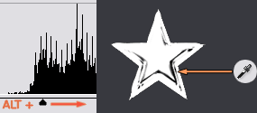
Drag the levels slider while holding ALT key to find the darker / brighter areas of the image (and how many colors would be cropped out). Then set the black and white point with the color pickers.

The metal texture of the star after the levels correction. The metallic effect feels much more contrasted and realistic.
Finally, you can set the midtones value by dragging the central slider once you have set your black and white points. This is the way to correct with levels how does your image feel once the contrast is adjusted: you can make it look brighter or darker without altering the overal contrast. It’s nearly like a gamma correction adjustment.
If the image still feels a little bit off, you can use a Brightness / Contrast adjustment layer to perform the final tweaks. You can achieve exactly the same by working with Levels (which is in fact a much more powerful Photoshop adjustment). But the brightness and contrast adjustments are much simpler to use, so give them a try if you have still any trouble with Levels.
Adjust the metal texture using Curves in Photoshop to fine-tune contrast
Adjusting contrast using Curves
Photoshop Curves are great for adjusting the contrast of the image, giving you the option to fine-tune the results.
Curves may be a little bit difficult to master, but they are a very powerful tool that allows you to create precise contrast adjustments and color corrections. So let’s see some simple steps to increase the realism of your metal texture using curves.
The first step, as we did with Levels, is to create a new adjustment layer by clicking the icon or selecting "New Adjustment Layer, and then choosing "Curves".
The idea is to find 2 brightness values in your image, one brighter and one darker, but both near the range of the midtones. Then we are going to darken even more the darker tones, and lighten the brighter tones. That is a way to precisely increase the image contrast.
Before editing the curve, it is necessary to take samples from you image. You need to find out which parts of the image are represented by which parts of the curve. Follow these steps:
- Open the curves window by double clicking the curve icon on the adjustment layer.
- Click on your original image with the color picker to choose a "dark midtone" and a "bright midtone"
- When you clicked on your image, the point representing that brightness value was marked in the curve.
- Click on these curve points to create new curve control points. You will adjust the brightness by moving such points.
Even a curve with 2 control points will do the trick. Once identified the 2 target points, move a little bit down the darker point (to make it even darker), and move a little bit up the bright point (making it even brighter).
And that’s it: typical "S" shaped curves, with little modifications, are used to increase image contrast. This precise color adjustment should work to enhance the contrast of your metal texture.
Adjustments performed using curves should be always subtle. Small changes in the position of the curve control point will have a strong effect on the image contrast. Don’t plot too many control points in your curve and don’t move a lot such control points.
Remember: keep the modification on the curve subtle, as the impact on the final image will be much greater.
If you need to fine tune the resulting contrast of the metal texture, just take the sample of the color range that seems to be wrong. Add a new control point in the related curve position and move the point till the contrast level is fine.
You have nearly completed your realistic metal texture! Now let’s add some color!
As we did with levels, we are going to work with curves in an independent Photoshop adjustment layer.
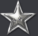
With curves window open, click on the image to take 2 color samples: 2 brightness values near the midtones, one darker (1) and other brighter (2).
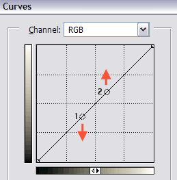
Move the sample points in the Curves Window: make the bright point brighter and the dark point darker.
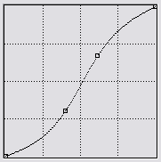
An "S" shaped curve with subtle tweaks is often used to increase image contrast.

The metallic effect of the star with a precise metal contrast correction done using Photoshop curves.