
Create Gold Chrome with Photoshop Hue / Saturation
Once the image contrast is adjusted, it’s time to improve the colors of the final metallic effect.
Hue / Saturation is probably the simplest and easiest way to color an image in Photoshop.
Let’s see how Hue and Saturation work in Photoshop trough an example in this tutorial. We are going to turn your metallic style into a gold chrome effect.
As we did with contrast adjustments in the previous step of this tutorial, we should create an independent new adjustment layer with the Hue / Saturation corrections. So we can keep the original chrome intact, re-adjust the hue & saturation parameters later and control the intensity of the color correction through the adjustment layer opacity.
Open the Hue/Saturation window by double clicking the new adjustment layer icon. It’s important to activate the Colorize checkbox. That way, the selected color will be applied to all the image elements, replacing any previously existing color.
Drag the hue slider to select the target color of the chrome effect. We will be using a desaturated mid yellow hue to create this gold chrome Photoshop effect as an example.
It is useful to check the color bar at the bottom while selecting the hue to colorize the metal. Such color bar is a good reference to see which color is being actually applied to the whole image.
It’s often a good idea to start with high saturation values and decrease them after picking the desired hue. So you can quickly identify the color that you are using as your new metal color. Finally, lower the saturation value to achieve a more subtle and realistic colored metal effect.
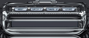
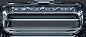
The original metallic silver chrome interface.
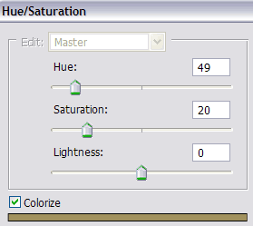
Performing a Photoshop Hue / Saturation color correction with colorize active, to turn metals into gold.
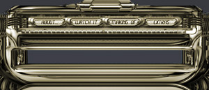
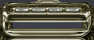
After the Hue / Saturation color correction, the silver chrome is turned into a gold chrome effect thanks to Photoshop.
Typical saturation values used for gold coloring purposes range from 10 to 30. In this example, the color values used to achieve the gold style in Photoshop are Hue = 49, Saturation = 20 and Lightness = 0. Don’t change lightness as it may wash out any previous image contrast adjustment.
The only drawback of using colorize is that any other color or hue used in the original design would be replaced by the new hue chosen for this coloring process.
On the other hand, Hue/Saturation Colorize works great with metallic chrome styles, as these are silver looking and low saturated pieces of metal. So there is no former color on your desaturated chrome metal that would be lost during the gold coloring process.
We have just seen that creating a gold chrome effect with Hue / Saturation is very easy to do. Read on to find an even more advanced way to color chrome effects in Photoshop.
Color Balance in Photoshop: coloring with precise adjustments
Besides Hue / Saturation is a simple tool for coloring, it lacks some more fine grain color controls. That’s why we are going to learn how to use a much more powerful Photoshop adjustment to color your chrome style with absolute precision: Photoshop Color Balance.
The main advantage of Color Balance is that you can separately tweak shadows, highlights and midtones, giving you a lot of control over the final coloring result rendered for your metals.
An additional advantage of the precise coloring achieved with Photoshop color balance is that it won’t override any previously existing color. So if you tweak carefully your image colors using this precise option, it may preserve some previously existing colors.
If you are trying to simulate a light source, try to match the color of such light source in the highlight section.
The true color of the metal itself should be applied to the shadows of your metallic texture.
Finally, the midtones should be adjusted to a mixed color of the light source and the true metal color.
Take into account that chrome, silver and most metals have a black diffuse color, and so their main color is taken from the environment (the reflections plus the light source color).
On the other hand, the gold style metal of this example has a dark, low saturated yellow color. So we are going to tweak specifically the shadows and midtones increasing the amount of golden tones.
To adjust the final color using color balance, just drag the RGB sliders till the resulting color is your desired hue.
Sometimes it’s useful to think about the inverse process: which color cast should I remove to achieve the desired hue? Decrease the amount of the undesired colors, and increase the amount of the chosen hues till the final color matches your expectations.
Keep the Preserve Luminosity option checked, as it will preserve most of your previous contrast adjustments while you crete a new color balance for your gold effect.
You can create very interesting special effects using color balance in Photoshop. In this other example I have created a cold metal, with a modern high-tech style. It’s just an easy color adjustment, that relies mainly on increasing the amounts of Cyan (specially in the shining metallic highlights) and Blue (specially in the metal shadows).
Photoshop Color Balance allows independent adjustment of shadows (left), midtones (center) and highlights (right).
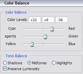
Adjust advanced color balance options to create a precise gold metal in Photosop.
An example of a gold effect created with advanced Photoshop color balance corrections.
Another tutorial example showing a cold high tech interface thanks to Photoshop color balance adjustments.
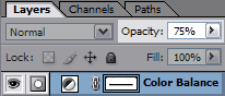
Subtle color corrections are more effective: control the coloring intensity by tweaking the opacity of the adjustment layer.
Consider that effective color corrections are just subtle tweaks. Don’t push too much your RGB sliders or you won’t get any realistic coloring effect.
As you are performing these color corrections in their own independent layers, you can easily tweak the intensity of the effect by adjusting the layer opacity. So if you think your Photoshop coloring has gone too far, and that your final cold or gold colors are over-the-top, just decrease the opacity of the adjustment layer!
Congratulations! You have completed the tutorial. Now you are ready to create your custom chrome Photoshop styles, specially useful to create metallic looking interfaces. But now you can take a look at a video example demonstrating the main steps explained through this tutorial.