
Global Marketing logotype design – marketing logo designs based on clean lines with a global touch
Key Global Marketing logo design ideas
Global Marketing provides printing, design, advertising and direct marketing services.
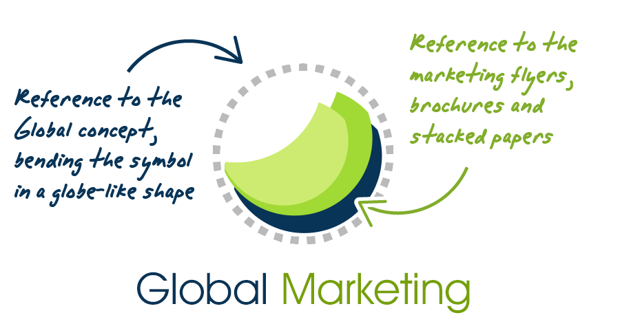
This corporate logo design is based on the idea of stacked sheets of paper, reminding of a world globe.
Global Marketing logo requirements
- The logo style should be modern as well as laconic. They wanted to convey a clean and professional corporate identity.
- The logotype may include any anagram. But a world globe symbol would be too obvious and should not be used in the logo design.
- The corporate logo should depict all inclusiveness of printing services, global scale, creativity and elasticity.
- As their corporate identity had no colors already defined, the logo may use any color scheme.
- The resulting corporate logo designs should look modern, strong and vibrant.
Why this corporate marketing logo design works
The final logo design is based on the idea of “marketing brochures”, or sheets of paper, with a subtle “world globe” look. It’s a modern, abstract and distinctive symbol, that perfectly represents each main feature of this marketing company corporate identity, as I will explain in the following lines.
As Global Marketing provides direct marketing, creative and printing services, I decided that a marketing brochure looking symbol, or just a “sheet of paper” composed by clean lines would be a fine starting point for the logo design. So I created some bright color stacked blank sheets of paper, as they looked modern and print industry related.
On the other hand, it was necessary to add something “global related” to this logo design. A world globe was strongly discouraged for being a topic. But tweaking my initial sheets of paper into a somehow abstract world globe logo symbol would be a good idea. The global concept was very important for this marketing company, as the world “Global” was even a part of its name. And their new corporate identity logo designs should take into account the global scale of their business as well.
Another customer priority was to convey some elasticity feelings through their new corporate logo designs. So I tweaked my “global sheets of paper” logo design. The new logotype symbol became strong and compact (in fact, even easier to print and recognize). And the softer rounded lines added to this logo design gave an inviting, flexible, adaptable and elastic feeling, as the customer’s marketing company wanted to convey.
Then, I wanted to focus on the “forward thinking” idea to strengthen even more the modern look of this logo design. In my final marketing corporate logo design version I adjusted the global marketing symbol adding ascending lines. This conveys a feeling of innovation and progress to the whole corporate identity.
![]()
The font chosen should complement the design ideas already exposed for the corporate logo symbol design. So I chose a modern looking, clearly readable font, based on soft and clean lines. Finally, the color scheme selected remarks the vibrant and modern corporate identity of the Global Marketing company.
The global looking sheets of paper logo symbol takes into account every key idea of the Global Marketing company, and stays away from topic logotype images at the same time.
Other corporate logo designs and variants
![]()
Dark background logo design
The previous global marketing logo was a very affordable and easy to print design. It was still a good idea to to add a slight variant that worked also on dark backgrounds. Besides white backgrounds are the most common ones, printing your corporate identity on a black satin brochure is also a high-end distinctive marketing strategy, that can make your colors look even more vibrant.
This global marketing logo design preserves the original color scheme, but adds a lighter blue tone which makes the whole symbol clearly readable against dark backgrounds.