Internet world logo design: a web 2.0 logo design for JP enterprises, an Internet business company
Key ideas of the web 2.0 Internet world logo design for JP company
JP enterprises is a modern company, focused on Internet business.
This logo design features the company initials, JP, as a connected Internet world, creating a dynamic and professional web 2.0 style logo.
Requirements of JP company logo design
- The desired logo design should be modern and professional, serious, with some web 2.0 style.
- This logo design could include the company initials, JP, as well as the company name.
- There is no color limit defined for this logo. A design based on blue and gray colors is preferred.
- The idea is that the logo should depict a modern and professional Internet business company.
An Internet company logo design that works: the Internet world logo explained
The key was to combine the company initials, JP, in a modern web 2.0 logo design that could seriously depict the professional image of an Internet business. That’s how the Internet World logo was created: a world connected by JP shaped data streams.
A connected world image is one of the most widely accepted Internet symbols. So including such Internet world would be very appropriate for an Internet based business. On the other hand, a good logo design should make the company name memorable, and thus I chose to focus on this Internet business company name, JP. By designing a swoosh looking JP symbol I created a modern JP Internet world logo design, that looked like a connected world, with dynamic JP shaped data streams.
A modern blue and light gray scheme was chosen for the final logo design. It’s a trustworthy and professional color scheme, but also modern and innovative, very appropriate for an Internet business. The subtle color gradients used give some eye-catching and web 2.0 touch to this logo design, making it stand out.
The chosen logo typography is a pretty clean font: simple, straight to the point, serious and professional. While the logotype symbol is a modern and innovative Internet world design, the logo typography follows a more conservative serious and professional approach, but it still fits the modern logo design style, balancing the main name and the “enterprises” part as a bottom complement.
The final logo design effectively mixes the best features of web 2.0 logo design style (eye-catching gradients, a modern and detailing design, friendly and inviting elements, etc.) with more traditional elements (a clean typography and a simple and straightforward composition), becoming both a modern and professional logo design, appropriate for an Internet business company.
Variants of this internet world logo design

Geometrical JP logo
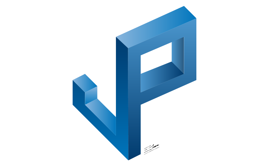
The first drafts on this logo design focused on a modern depiction of the company name initials, JP, as a more geometrical concept. A JP anagram was created with some 3D effects, supported by the gradient shadows and higlights of a modern blue color scheme. After some consideration, the blocky, geometrical approach of this design seemed more appropriate for an architecture studio, or something connected with construction, so the "Internet world" logo was chosen instead.

White Internet world logo design
This variant of the Internet world logo design is a printer-friendly white background logo version. It just requires 3 flat colors (with a color gradient) to be printed, becoming very affordable to print, and keeping that web 2.0 eye-catching style through the modern JP symbol. While the black background version can still be used as the main version – as there is virtually no restriction when using the logo on a computer screen – printed surfaces tend to have white backgrounds (such as it happens on most papers,) so this alternative design version provided will come in handy in all these usual situations in the day-to-day branding process.
While the main black background internet world logo would look great on a webpage, this logo design is very easy to print, and would work perfectly on business cards or any other traditional media.


