
Learning Craft logo design: a modern logotype for a corporate online training and eLearning company
Key principles of this corporate online training logo design
Learning Craft is an eLearning and online training company. Its philosophy is based on the idea that with education you can achieve the future that you want. The main company tag-line is: opening doors to your future.
The LC logo design is an original symbol that has a modern and constructive feeling. This logo reminds of the structure of an opening door.
Learning Craft requirement specification about their logo design
- Learning Craft was seeking a simple, clean and modern logo design.
- The logo should include any symbol, avoiding topic learning symbols.
- No company color scheme was already defined. The logotype may include any number of flat colors.
- The company name, Learning Craft, as well as the company tag-line, opening doors to your future, should be included in the design. The logo should focus on these learning concepts.
A modern corporate training logo design that works
The main idea behind this logo design was to create an original LC (Learning Craft) symbol that reminded of an opening door structure, as the company tag-line was “opening doors to your future”.
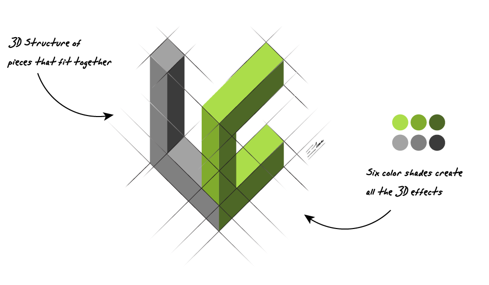
A company that provides eLearning and online corporate training should have a corporate identity that conveys feelings of being modern and trustworthy. The modern LC symbol of this logotype is a modern design based on pieces that fit together. It’s an abstract and constructive approach to learning and any form of training: new knowledges are built upon former ones, in a balanced way. This modern symbol has also a 3D effect, it’s appealing as a graphic design by itself, and reminds of the structure of an “open door to your future”.
Since this company offers eLearning services and professional online corporate training, the font used for the company text design and the logo tag-line should be clean, smart and professional. A light and modern sans-serif font was very appropriate for this task, as it conveyed a clever and modern corporate image.
I finally chose a color scheme based on acid green tones plus gray tones. This color combination gives the logo a very modern look and feel. The gray colors add a serious professional touch to this logo design. On the other hand, acid green colors convey a vivid feeling, are related to hope and new chances, and lead the observer’s view upwards through this whole eLearning logo design. And all those interesting and realistic 3D effects were achieved just by using six flat colors. Extremely eye-catching, but still, a printer friendly and affordable logo design.
The conclusion is that the LC Learning Craft logo design is both a modern and corporate professional design that may appeal a wide audience about its eLearning and online training services.
Variants of this eLearning logotype design
![]()
Black background logo variant
This is exactly the same logo design as the main Learning Craft logo, but this time I used a black background. This eye-catching eLearning logo design, made of just 6 flat colors, works perfectly on both clear and dark backgrounds.
In an eLearning and online corporate training company, conveying an elegant and professional image is critical when convincing new customers. And presenting business cards or brochures on a black satin paper always results in a very convincing and elegant corporate identity or logo design.