
All Options logo design: logo design for a trading analysis and international market creation company
Ideas of the All Options logo design
All Options is a company specialized in options trading analysis and international market creation. This is achieved by using state-of-the-art trading and pricing applications.
This logo design focuses on a dynamic symbol that depicts the concept of exploring “all options” in international market creation as dynamic, interconnected lines, combined with a clean and professional typography. The high-tech concepts of this market creation and trading analysis company are combined with the concepts of trust and expertise in a very unique and iconic symbol.
Requirements specified by this trading analysis company about their logo design
- All Options was looking for a business professional logo design about market making and trading analysis.
- The logo design should represent trustworthy, professionalism, substantiality, success and finances.
- The full company name, All Options, had to be included in the logo (being case insensitive).
- No corporate colors, fonts or symbols were specified. The logo had to be kept under 5 flat colors.
The professional logo design of All Options analyzed
This logo design started by creating an original logo symbol based on the company initials: A.O. I designed a modern "O" logo icon combining two "A" symbols, that reminds of arrows pointing in every possible direction: that’s how this logo depicts the All Options concept – considering every possible direction, analyzing trading data for international market creation.
![]()
So these arrows creating a circular structure, where they point in every direction, are the key of this logo design. It’s a very dynamic symbol, original and modern, related to considering every trading option and data in market creation. The advancing perspective of the whole logo symbol increases this motion effect, and remarks the idea of progress and success.
The color scheme chosen uses 4 tones: vivid reds (to convey an idea of strength and dynamism, as the main accent color) and silver grays (that act as an elegant and professional counterpart in this image). The result is a professional, modern and eye-catching logo design, that takes advantage of the color shades to increase the 3D feeling and depth of the logo, making it even more eye-catching and attractive.
![]()
A classic typography, professional and easy to read, was chosen to depict the company name. It combined sharp edges with soft curves, as the main logo does symbol, keeping coherent the whole logo design. The capital letters convey and idea of big and experienced company, while both parts of the company name are remarked using different colors. A consistent subtle perspective/shading effect was also used in the text, coherent with the main “All Options” design.
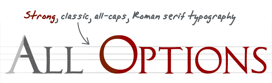
The “All Options” logo design is based on a very dynamic, modern and original symbol that depicts the idea of considering all options and analyzing all data through the “arrows pointing everywhere” concept. The whole style of the logo design, through subtle references to the main abstract ideas of the client company, is a clean and professional concept very appropriate for a trustworthy international market creation company that uses state-of-the-art analysis techniques.
![]()
Other logo design choices for All Options
![]()
Alternative star logo
The initial drafts of this logo design focused more on depicting such an abstract concept as “options” as pointers aiming in different directions, and more like a three-dimensional illustration, with geometrical 3D objects (tetrahedron solids or pyramidal structures) drawn into the design.
This is how this four-pointed star-looking logo was created. The emphasis of the design was on showing something modern, with a reference to differenet paths, and conveying success-related ideas through is star resemblance. On final stages of the design process, the other logo was chosen as the design approach to go, since it felt lighter, more iconic, and more appropriate for a corporate sector like market trading.
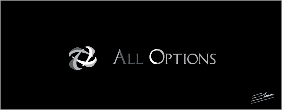
Elegant silver logo design
This All Options logo version looks like an elegant silver logo, that takes advantage of 4 shades of gray to convey an appealing metallic effect.
It may be a little bit less eye-catching than the main logo version by sacrificing the red tones, but it’s an elegant and professional logo design, that stands out perfectly against dark backgrounds. It’s even easier to print, because it’s a pure grayscale approach. Another appropriate choice for a professional market creation company.
Even in grayscale, the result is a distinctive symbol, where lots of subtle symbolism about the main abstract concepts of the target business activity, and about its AO initials and the idea of All Options, have been blent into a very unique logo that can be appropriately used in a market creation and trading corporation.