
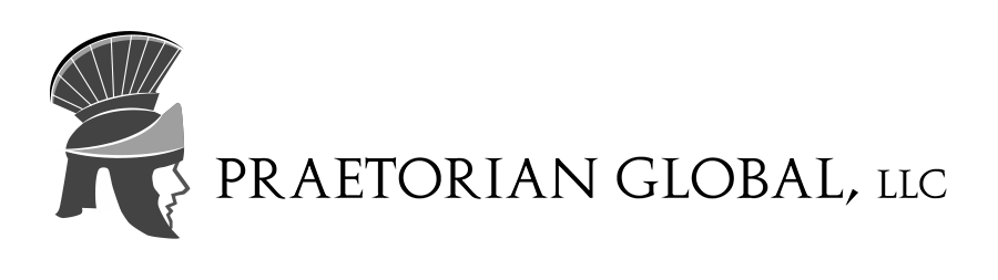
Praetorian helmet logo design: an elite protector symbol for Praetorian Global computer security
Key ideas of the Praetorian Helmet logo
Praetorian Global is a computer data and network security company.
This praetorian helmet logo design depicts and elite protector in a modern, original and stylish way.
It combines the praetorian guard concept with a contemporary design, appropriate for a modern computer security company.
Requirements specified by Praetorian Global about their logo design
- The Praetorian Global logo should depict the main company ideas: security, inspired by Caesar’s elite protector – a praetorian guard.
- The logo could contain any number of colors (without gradients) as long as a black and white version was provided.
- Any praetorian guard related symbols could be used in the logo design: a praetorian shield, a praetorian helmet, etc.
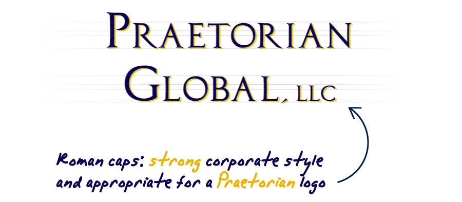
- A roman looking font is preferred, which should be used to include the full company name, Praetorian Global, as a part of the logo design.
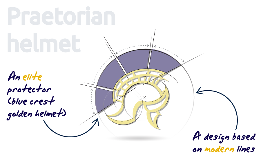
Praetorian logo design explained: the praetorian helmet of an elite protector
This logo design represents the concept of an elite protector (a Caesar’s praetorian guard) depicted through a praetorian guard helmet symbol, based on modern stylish lines. This way the Praetorian Global logo design combines both key company ideas: the elite security of the praetorian concept, and the modern computer security concept, together in a single modern logo design.
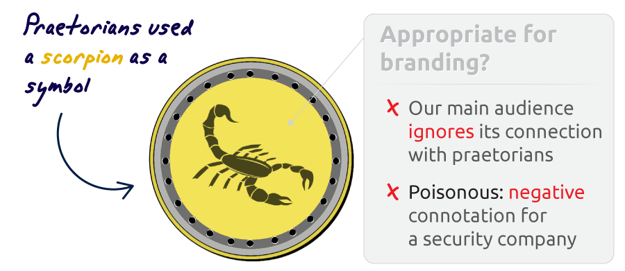
The traditional symbol of the praetorian guard is a scorpion. Nevertheless, after some research, it was clear that our target audience wouldn’t recognize a connection between a scorpion symbol and a praetorian guard. Moreover, scorpions are poisonous creatures, and that will include a concept of danger into the design, when we want to highlight precisely the opposite idea – security and safety in the hands of a trustworthy guardian. This explains why staying with the elite security logo ideas tied to the roman helmet of the praetorians would be more appropriate.
The color scheme chosen for the praetorian helmet design is based on blue and gold complementary colors. This color combination is often used in the logos of high-end products, and it tends to catch attention while gaining customer’s trust. On top of that, gold is related to high-end and luxury, which is very appropriate to represent the elite protector idea of a praetorian guard. And the blue color by itself is related with trust and technology. So the result is a praetorian helmet logo that depicts a trustworthy elite guard.
![]()
Using a Roman-looking font was a great choice of Praetorian Global: that kind of fonts not only convey a serious corporate professional look, but also match the roman inspired look of the praetorian helmet logo. Roman fonts work great on capital letters, which emphasize the idea of big, solid and trustworthy company.
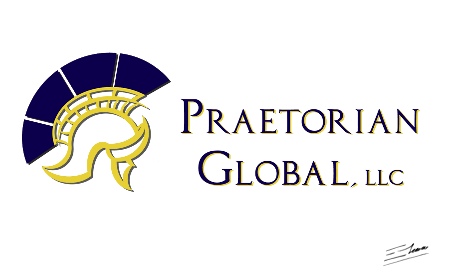
The final Praetorian Global logotype design is based on a praetorian helmet logo that depicts an elite protector, with a modern touch. This way, the computer data and network security company conveys a serious, reliable, and distinctive corporate image.
Variants of the praetorian helmet logo design
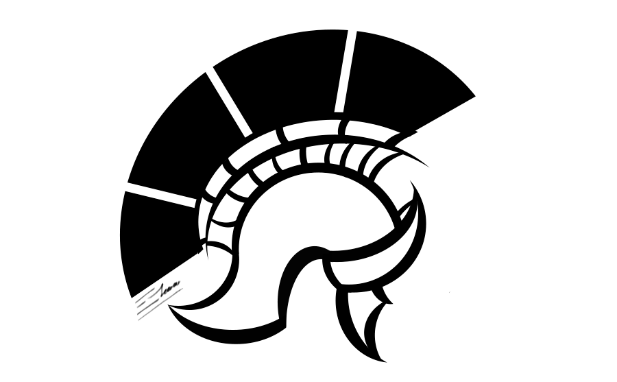
B & W Praetorian helmet logo
This is the black and white version of the praetorian logo design, as requested by the client’s company. Having a design that works on just black and white colors makes sense, as there will always be situations where your logo will need to be printed this way, under very restrictive one-color conditions.
As this design version demonstrates, the final praetorian helmet logo is a solid design, original, distinctive and easily recognizable, that can be easily printed using just a black color, while keeping the idea of elite protector of a praetorian guard.
Praetorian guard face & helmet logo
This is an alternative design of the final praetorian helmet logo that also works on just a black color. It’s in fact a more classic approach, that relies more on a bold and solid image, as a simplified illustration, than on modern stylish lines.
The strong point of this logo version is the trustworthy human face shown through the the praetorian helmet itself, giving a more personal touch to the design, trying to build trust while keeping the idea of an elite praetorian guard. However, the first design option was finally chosen as the top design since the original helmet seemed a more distinctive, iconic and unique praetorian-inspired logo.