
Professional lawyer firm logo design: a design for the CFA law firm
For successful legal marketing, your law firm’s communications should reinforce your brand. And your brand begins with a logo. For logo design, PR and web content writing, request a free quote from Legal Media Matters.
Key concepts of these professional lawyer logos
CFA (Claude F. Archambault and Associés – Avocats) is a professional lawyer firm.
This logo design remarks the firm name initials in a way that reminds of legal documents.
The key was to stick to the design guidelines we defined for the best law firm logos at Legal Media Matters.
This logotype design conveys a clean, serious, classic, trustworthy and professional law firm identity.
Requirements specified by the lawyer firm about their professional logo design
- CFA logo had to be a serious and professional logo design, appropriate for a trustworthy law firm.
- No corporate colors were specified. The color limit of this logo design was up to 3 flat colors.
- The lawyer firm name initials, CFA, could be included in the logo, but the full firm name had to be also part of the logo design.
- Handwritten script fonts had to be avoided. Overused lawyer-related logo topics had to be avoided as well, such as gavels, legal scales, blind justice symbols, stars, arrows, buildings, circles, globes, flags and geographical references.
Details of this professional logo design for a lawyer firm
As the customer’s lawyer firm specified a lot of restrictions about the symbols that could be used in this logo design, focusing in the very professional law firm name seemed the best starting point. The main element of the logo would then be the firm name initials: CFA.
![]()
This simple and classic logo design approach was turned into a lawyer-related concept by adding a bent corner effect to the main square symbols. The bent corner design conveys an idea of paper sheets, which look like legal documents, and make the whole logo seem professional lawyer firm related. On top of that, the bent corner catches the attention and leads the view through this lawyer firm initials.
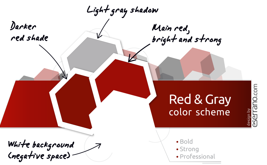
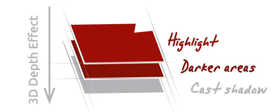
Lawyer logo designs should be trustworthy and strong. So a red color scheme was chosen for this logo design. It’s a bold color scheme: bright, but also professional; strong and serious: appropriate to symbolize a law firm that relies on prestige, strength and trust.
Three colors (plus some smart usage of the white background, the so-called negative space) were enough to create some three-dimensional shading effects: that way, this lawyer logo design stands out without becoming too print expensive, even when using exact spot colors.
In a simple text-based logo design the importance of the typography used becomes critical. I chose a classic serif font and then I customized the font design to make it more distinctive. In fact, this follows the most important ideas of the best fonts for law firm logos I’ve already discussed in my articles as a legal logo designer.
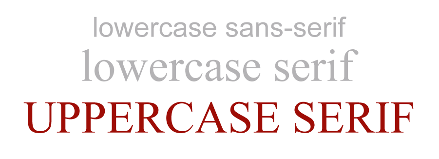
By using all capital letters in the design, the idea of strong professional firm is reinforced. The connection of the full company name with the CFA symbol is strengthened by using bold first letters. The result is a serious lawyer firm identity, clean and professional.
The whole lawyer firm logo focuses in the company name in a clean, professional and straightforward way, far from overused lawyer-related design topics. Every detail in this serious and classic logo is designed to convey an idea of trust and strength.
Variants of this professional lawyer firm logo design
![]()
Dark background logo design
This is the logo version optimized to work on a dark background. It’s possible to print a very similar 3 color logo version that works perfectly on a dark background just by dropping one red shade and taking advantage of the constrast between black and white colors.
With these two logo designs, this lawyer firm will be able to use its logo on any surface, while keeping a serious and coherent professional logo and firm identity.