
A corporate logo design for a financial support company
Key ideas of the design for this financial corporation
Rapid Funding Group is a company specialized in financial support services.
This logo design depicts a modern and memorable symbol that conveys ideas of speed and fast services.
The original symbol is combined with a conservative font, to create a professional and attractive design.
Requirements specified for this logo design
- The logo should invoke feelings of respect and progression.
- It has to be a a modern logo design, eye-catching and memorable, while staying professional.
- The design may contain any number of colors as well as color gradients.
- No clichéd wealth symbols may be used in the logo.
- A conservative font is preferred. Include the full company name (Rapid Funding Group).
- Also try to include the company tag-line in the logo design.
Corporate logo design of this financial company explained in detail
The starting point for this logo design was to focus on the main ideas of this company: it had to be something fast, quick and rapid, it had to be related to financial support, and it had to convey a professional corporate feeling.
The main logo symbol started as an abstract design of three stacked bills, taking advantage of the blank space of this design. By sharpening the edges of the bank notes contour I added a fast motion effect to this logo design (depicting speed and progression). So the result is a modern symbol, with an abstract connection to money, and that depicts speed and progression through the design of its stacked symbols.
![]()
A not-too-intense red color scheme was chosen for this logo design, as these colors convey an idea of strength and vitality while keeping the design professional. A warm color scheme increases the dynamic effect of the logo symbol and is appropriate for a fast service company, which should earn customer’s trust and not look intimidating or stark (earlier stages of the design process even suggested that an approach like a falcon or a hawk symbol could be used as part of the design, but a bird of prey was strongly discouraged for the negative connotations it could have in this money-related context.) Finally, the logo gradients and shading effects create a subtle 3D effect that makes the logo design look even more contemporary and modern.
A conservative and classic serif font was chosen to write the company name. That way, the observer’s attention is lead from the fast symbol to the logo text, which looks like a solid and stable block. This serious typography remarks the idea of professional and trustworthy company, balancing the logo design in combination with the more modern symbol.
This corporate logo design succeeds in satisfying the main company requirements: it’s a modern design, related to the rapid concept and with a subtle connection to financial support ideas – combining a modern eye-catching style with a serious and professional design.
Other logo design proposals for this company
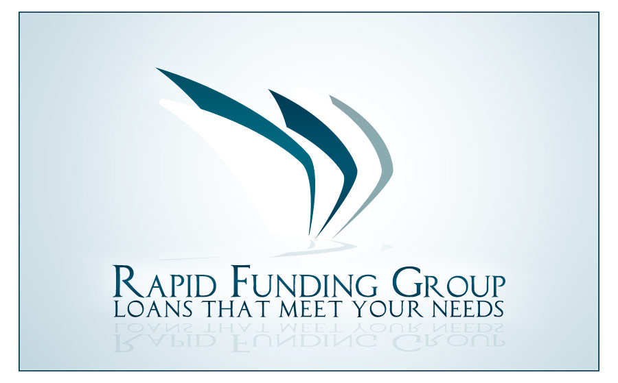
Relaxing alternative color scheme
This RFG logo variant presents a relaxing blue color scheme. The new logo design strives to stay away of the stressful relationship that can be established when dealing with the funding issues that are the day-to-day activity of such company. So this design tries to remove any aggressive connotation, and conveys ideas of trust and support, as the aim of the company is after all to solve issues.
This logo exchanges the dynamic and lively idea for a relaxing solution design – this is actually the corporate image I recommended as a more traditional financial company.